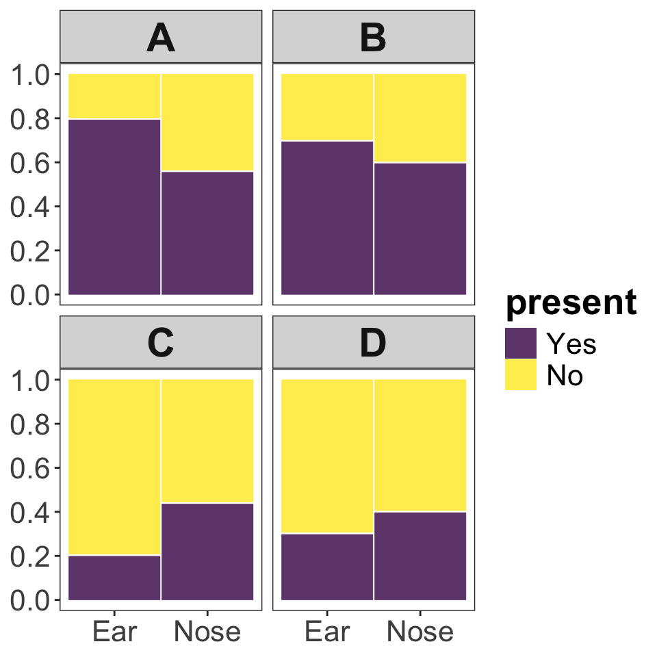
| Yes | No | |
|---|---|---|
| Ear | 40 | 10 |
| Nose | 28 | 22 |
2 Graphics
For this problem set you will need to use R. In RStudio running on Koa in your student folder you will find an empty R script (called pset_02_graphics.R) waiting for you that you can use to complete aspects of this problem set that require R. But please note: you still need to turn in the problem set via the google form found in google classroom.
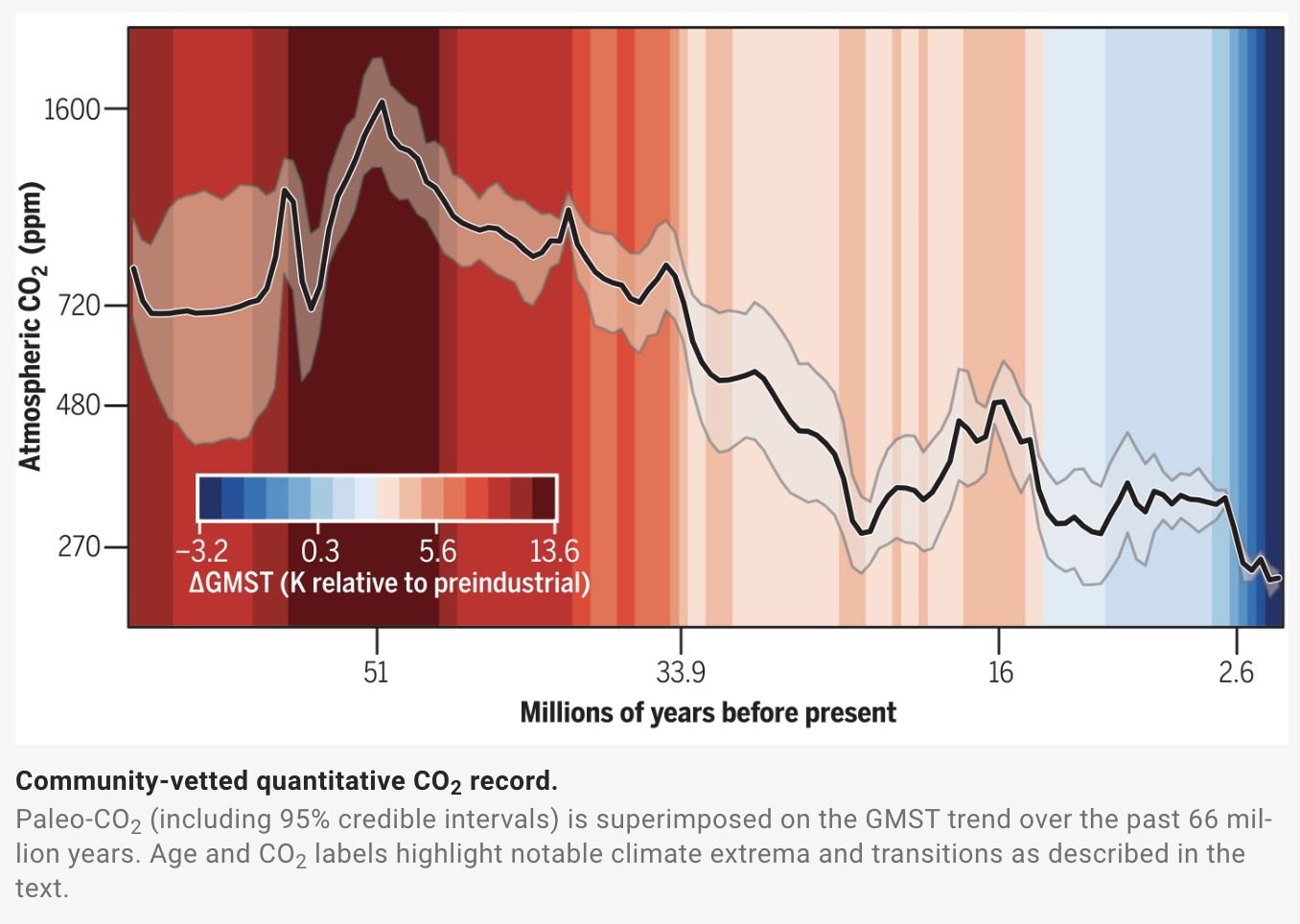
Fix this graph!
Consider the graphic below from an article in Science by the Cenozoic CO2 Proxy Integration Project Consortium. The data visualization attempts to show complex data about the change in atmospheric CO\(_2\) and average global temperature over the past approximately 65 million years.
Use the figure above to answer questions 1 & 2.
Hints: on the legend for the color scale, where is 0? Look closely at the tick marks of the axes. What messages do the authors want to communicate about these data; what are the patterns they’re trying to show? Do they achieve their goals?
Identify two instances in which this graphic deviates from the best practices for data visualization rules that we covered in lecture. There are multiple possible answers. [2 points]
For each of those two deviations from best practices, suggest a remedy to improve the visualization. [2 points]
Interpreting figures
Consider a situation in which bacterial swabs were taken from the ears and noses of 50 study subjects, and the number of swabs that showed or did not show the presence of Staphylococcus were recorded. The table below shows the results of the measurements.
Use the information in the above table to answer question 3.
- Which of the plots shown below (A, B, C, or D) correctly depicts the Staphylococcus swab data? [1 point]
Making graphics
Draw a graph by hand!
Sketch out a histogram (with 5 bins of equal size as appropriate) showing the distribution of the following values:
2, 3, 3, 4, 5, 7, 8, 8, 11, 11, 12, 13, 15, 15, 17, 18, 18, 23, 24, 32, 33, 34, 35, 38, 41, 42, 43, 48You should draw a good, honest, clear histogram BY HAND either on paper or digitally, then submit your graphic by uploading it via the Google Form [2 points].
Now you’ll fix some ggplot2 code to improve the quality of the below figure:
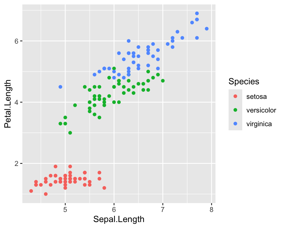
This is a similar figure to one we have thought about in lecture. In lecture we looked at bird body mass and bird wing length for non-native species in Hawaiʻi. This figure shows body mass and flipper (aka wing) length for three species of penguins.
Improve this figure!
Here is the code needed to produce the above visualization of the penguin data:
library(ggplot2)

# note: the `penguin` dataset we need is made available to us via the
# `palmerpenguins` package
library(palmerpenguins)

ggplot(penguins, aes(x = body_mass_g, y = flipper_length_mm,
                     color = species)) +
    geom_point()
You will need to install the palmerpenguins package following the instructions from Lab 02 about how to install packages in R.
[3 points] Choose two aspects of the penguins data plot that you think should be improved. Then starting with the above code, add to it with additional commands to realize the improvements you’d like to make.
To turn in your answer for this question simply paste your final code into the google form. Include comments in your code explaining (briefly) what you chose to improve and why, e.g.:
# 1. Change the colors to rainbow because go bows!
# 2. Change the points to diamonds because why not!

ggplot(penguins, .....
    ....
    ....
    ....
(note: these are not good changes to make)