# this is the same
x <- 10
# as this
x = 10
# as this
10 -> x3 R refresher
3.1 R and RStudio
These tools have been described extensively elsewhere. For completeness we better link to one: Carpentries’ R for Ecologists.
One distinction to emphasize: R is the language and environment for doing statistics, RStudio is a tool to make working with R a little easier. Here is a quick orientation to RStudio:
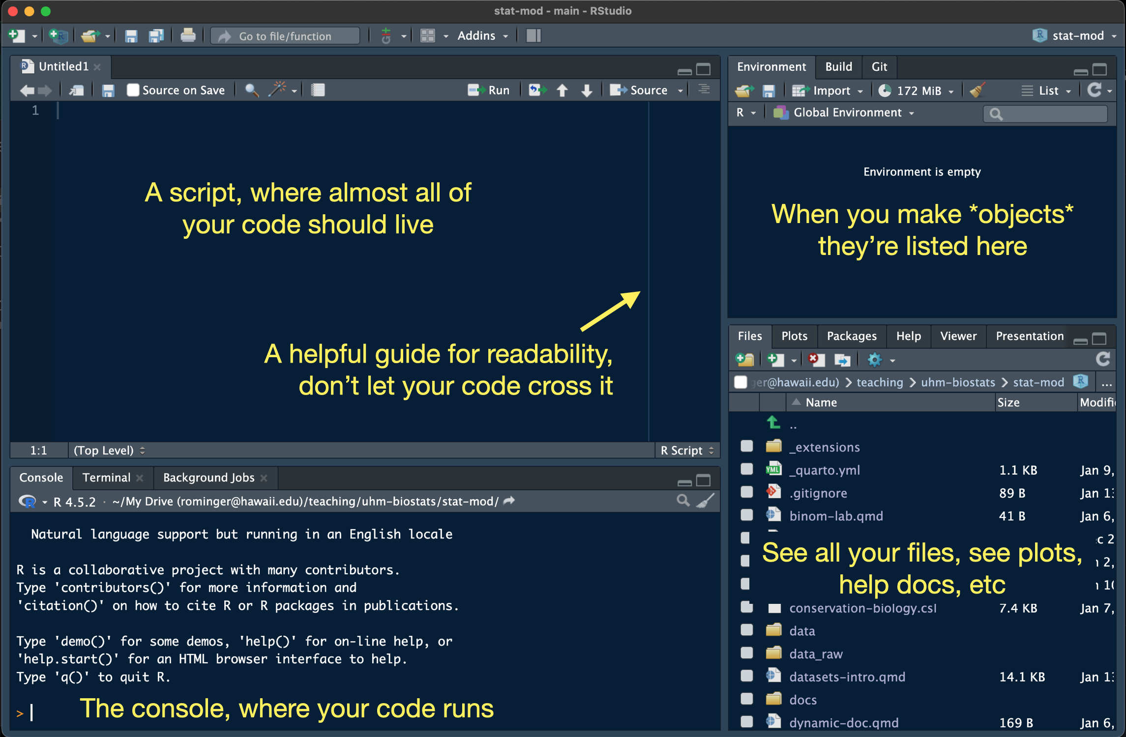
One way that RStudio is very useful is that it bundles our work into projects, each project living in a folder on our computer, and each getting a .Rproj file that saves administrative details about the project. RStudio automatically helps R find files we might need (like data files) inside the project. That’s a big help for writing clear code, and code we can share with others. To follow along with this tutorial, make a new project with File > New Project… and choose “New Directory”. Give your project the name “r-refresher” and save it somewhere on your computer. We will get more precise with naming and folder organization when we go over GitHub.
You can customize the way RStudio looks by going to Tools > Global Options and then apply the options you’d like, including setting the Appearance to a dark theme like the one pictured above. There are a few options you should definitely modify. Under the General - Basic section, make sure your selections match this:
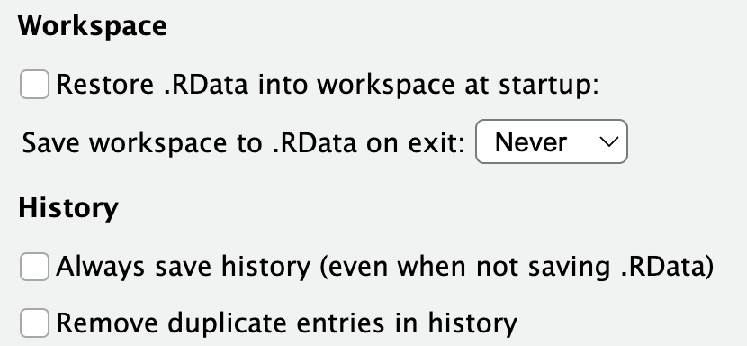
We don’t want to save or restore Workspace and History because we will end up completely bogging R down with months or years worth of random things. The only things you should treat as permanent and needing to be saved are scripts and data files.
Most R code we write should live in an R script. Open a new one with File > New File > R Script to follow along. Before we forget, let’s save that file giving it the name tutorial.R.
3.2 A few notes on R style
Andy your instructor has a problem (he’s aware of it) about being obsessive with coding style. To make life easier on us all, here are some guidelines we’ll stick to in the class:
3.2.2 Assignment character
R is a funny language, it let’s you make an object in multiple ways:
We will stick to using the most common style: x <- 10. This is called “assignment” because we are assigning the value 10 to the object x.
3.2.3 Tab spacing
Sometimes a long line of code can get broken up into multiple lines for ease of reading. Or some types of commands are nearly always broken up across lines. In these cases, new lines of code get tab indented and how wide the indent looks is up to you:
# 1 tab = 4 spaces
data |>
filter()
# 1 tab = 2 spaces
data |>
filter()RStudio defaults to making an indent two spaces wide. Let’s not do that, let’s use four spaces (Andy just finds it easier to read…aging eyes perhaps). Go to Tools > Global Options then select Code and set Tab width to 4. I poke fun at myself, but truth is, if your code gets complex, the extra space is a huge help in avoiding syntax errors and finding bugs when they do occur.
3.2.4 Naming
As we’ve already seen we need to name things (like x <- 10, here x is the name). There are lots of ways to do this
# I'm camel case
longNameOfSomething <- 100
# I'm snake case
long_name_of_something <- 100
# I'm a bad idea, but technically not wrong
long.name.of.something <- 100No shade on long.name.of.something it’s just that the dot . is usually reserved for a special purpose—not naming—across many programming languages (even, confusingly, kind of in R). When we need to make a long name, let’s use snake case for this class because the “data science community” seems to be adopting it across multiple languages (e.g. R and python). But also sometimes a short name will do the trick and doesn’t need any kind of “case.”
3.3 Real basic R
You’ll often here people talk about “objects.” In R, everything is an object.
# what you might call a scalar is an "object"
x <- 10
# what you might call a vector is an "object"
y <- 1:10
# even functions are objects
meanfunction (x, ...)
UseMethod("mean")
<bytecode: 0x10a59e760>
<environment: namespace:base>An object is just something that we make with code or is made for us with code. Objects come in different types
3.3.1 A few simple object types: numeric, character, factor
# *numerics* hold numbers (whether a single number of many)
x <- 10
y <- 1:10
# *characters* hold letter-type things (anything in quotes)
a <- "word"
b <- c("three", "little", "words")
# *factors* are like numerics and characters combined:
# they look like characters, but can behave like numbers if we need
f <- factor(c("a", "b", "c"))
f[1] a b c
Levels: a b c# cast the factor to numeric
as.numeric(f)[1] 1 2 3# can't do that with true characters
as.numeric(b)Warning: NAs introduced by coercion[1] NA NA NAFactors have levels that tell R what order to think about the characters in. That will end up being useful for plotting!
g <- factor(c("a", "b", "c"), levels = c("b", "c", "a"))
g[1] a b c
Levels: b c a# notice how the numbers changed
as.numeric(g)[1] 3 1 2The last “one-dimensional” type of object to learn about are booleans. These are just TRUEs and FALSEs that end up being very useful for wrangling data.
# we can make a boolean like this
bool <- c(TRUE, FALSE, TRUE)
# booleans also come by making "logical" comparisons
10 > 3[1] TRUE# we can compare objects
y == x [1] FALSE FALSE FALSE FALSE FALSE FALSE FALSE FALSE FALSE TRUEThe operation == is a comparison that asks is “this” equal to “that”: this == that.
We can already get a peek at how booleans can help wrangle data:
b[bool][1] "three" "words"What just happened? Putting bool inside square brackets [] after b extracted the value from b where bool was true.
3.3.2 Combining objects into something more data-like
We can combine these one-dimensional objects into 2D objects—these 2D objects are what we typically think of when we think of data.
Combine 2 or more objects of the same type and same size (like three elements long) to make a matrix
m <- cbind(f, g)
m f g
[1,] 1 3
[2,] 2 1
[3,] 3 2Combine 2 or more objects of same or different types, but still of the same size, to make a data.frame.
dat <- data.frame(b, f, bool)
dat b f bool
1 three a TRUE
2 little b FALSE
3 words c TRUEWe can make custom column names if we like
new_dat <- data.frame(words = b, groups = f, included = bool)
new_dat words groups included
1 three a TRUE
2 little b FALSE
3 words c TRUEWe can access columns in a data.frame in multiple ways:
# by name with the dollar sign
new_dat$words[1] "three" "little" "words" # by name using square brackets and a comma to indicate we want columns
new_dat[, "words"] [1] "three" "little" "words" # by position using brackets
new_dat[, 1][1] "three" "little" "words" # with booleans and square brackets
new_dat[, bool] words included
1 three TRUE
2 little FALSE
3 words TRUEThe data.frame is the data workhorse in R. There are also some things that seem confusing about them like this new_dat$words and this new_dat[, "words"] being equivalent. Those language design choices were made literal decades ago so we’re stuck with them. We are about to learn some newer approaches to working with data that attempt to bring greater consistency and clarity, but sometimes these “old school” methods are needed for specific tasks, so they are worth knowing.
Sometimes we may need to combine objects of different sizes, and maybe same or different types. That task requires one last type of object: the list
l <- list(y, g)
l[[1]]
[1] 1 2 3 4 5 6 7 8 9 10
[[2]]
[1] a b c
Levels: b c aLists can get special names too
new_l <- list(nums = y, group = g)
new_l$nums
[1] 1 2 3 4 5 6 7 8 9 10
$group
[1] a b c
Levels: b c a3.4 Working with real data
In real practice, we are rarely making a data.frame by hand. We are usually reading it in from a file. Let’s get the data we’ll be working with for this class, downloading it into the folder where our RStudio project lives. First make a folder called data inside the folder holding your RStudio project. You can do that in your computers folder system, or from within RStudio by hitting the icon of a holder with a plus over in the Files panel.
Your project folder should now have this structure
r-refresh/
├─── data/
├─── r-refresh.Rproj
└─── tutorial.RNow click the following to download each data set, making sure to save them in the data folder you just made
3.4.1 Keeping data tidy
Let’s read the data into R and have a look
tree <- read.csv("data/OpenNahele_Tree_Data.csv")One really REALLY nice thing about RStudio projects is that they take care of a lot of the headache around file paths for us. If I had to type out the full path to the data file it might look like /Users/Andy/teaching/zool631/r-refresh/data/OpenNahele_Tree_Data.csv or something else crazy depending on where I saved the folder r-refresh on my computer. Worse than the typing itself, if I shared my script, nobody else could just run it, they would have to modify the path. If they shared it back with me, I would have to change it again…and again…and again! RStudio let’s us use relative paths. No matter where the RStudio “r-refresh” project lives on our computer, it tells R to start looking for files inside the r-refresh folder.
To view the data we have a few options. We can always use a program or app like excel or google sheets to directly view the file. We can also look at the data from within R. Knowing how to look at data from within R is an important tool:
- we need to be able to confirm the data were read in correctly
- as we wrangle the data we’ll need to quickly and repeatedly look at the data objects to make sure we’ve done the wrangling right
# the `View` function opens up a tab where we can see the data.frame
# in a tabular display like a spread sheet
View(tree)# the `head` function prints out the first few rows into the R console
# this can look messy for `data.frame`s with many columns
head(tree) Island PlotID Study Plot_Area Longitude Latitude Year Census
1 Hawai'i Island 2 Zimmerman 1017.88 -154.91 19.444 2003 1
2 Hawai'i Island 2 Zimmerman 1017.88 -154.91 19.444 2003 1
3 Hawai'i Island 2 Zimmerman 1017.88 -154.91 19.444 2003 1
4 Hawai'i Island 2 Zimmerman 1017.88 -154.91 19.444 2003 1
5 Hawai'i Island 2 Zimmerman 1017.88 -154.91 19.444 2003 1
6 Hawai'i Island 2 Zimmerman 1017.88 -154.91 19.444 2003 1
Tree_ID Scientific_name Family Angiosperm Monocot Native_Status
1 6219 Cibotium glaucum 14 0 0 native
2 6202 Cibotium glaucum 14 0 0 native
3 6193 Cibotium glaucum 14 0 0 native
4 6248 Cibotium glaucum 14 0 0 native
5 6239 Cibotium glaucum 14 0 0 native
6 6241 Cibotium glaucum 14 0 0 native
Cultivated_Status Abundance Abundance_ha DBH_cm
1 NA 1 39.30 14.3
2 NA 1 39.30 13.5
3 NA 1 39.30 17.8
4 NA 1 39.30 7.2
5 NA 1 9.82 30.9
6 NA 1 39.30 14.2# the `str` function prints out the *structure* of the data, showing you
# the data type of each column and a preview of its contents
str(tree)'data.frame': 43590 obs. of 18 variables:
$ Island : chr "Hawai'i Island" "Hawai'i Island" "Hawai'i Island" "Hawai'i Island" ...
$ PlotID : int 2 2 2 2 2 2 2 2 2 2 ...
$ Study : chr "Zimmerman" "Zimmerman" "Zimmerman" "Zimmerman" ...
$ Plot_Area : num 1018 1018 1018 1018 1018 ...
$ Longitude : num -155 -155 -155 -155 -155 ...
$ Latitude : num 19.4 19.4 19.4 19.4 19.4 ...
$ Year : int 2003 2003 2003 2003 2003 2003 2003 2003 2003 2003 ...
$ Census : int 1 1 1 1 1 1 1 1 1 1 ...
$ Tree_ID : int 6219 6202 6193 6248 6239 6241 6266 6274 6264 6289 ...
$ Scientific_name : chr "Cibotium glaucum" "Cibotium glaucum" "Cibotium glaucum" "Cibotium glaucum" ...
$ Family : int 14 14 14 14 14 14 14 14 14 14 ...
$ Angiosperm : int 0 0 0 0 0 0 0 0 0 0 ...
$ Monocot : int 0 0 0 0 0 0 0 0 0 0 ...
$ Native_Status : chr "native" "native" "native" "native" ...
$ Cultivated_Status: int NA NA NA NA NA NA NA NA NA NA ...
$ Abundance : int 1 1 1 1 1 1 1 1 1 1 ...
$ Abundance_ha : num 39.3 39.3 39.3 39.3 9.82 39.3 39.3 39.3 39.3 39.3 ...
$ DBH_cm : num 14.3 13.5 17.8 7.2 30.9 14.2 24.8 20 20 14.5 ...Let’s talk about the organization of the data. As stated in the chapter on CARE and FAIR, well organized data is integral to making data Interoperable and Reusable which are integral to CARE as well.
The data in tree are organized so that each row is an individual tree and the columns represent data about that tree. Column Island tells us what island that particular tree was growing on. Column PlotID tells us the unique ID of the inventory plot where that tree was growing. Island and PlotID have many repeating values because many trees were sampled from the same plots on the same islands. The repeated values might seem like an inefficient way to store data, but actually there are many advantages to storing data this way.
Consider an alternative: each unique PlotID gets its own row. Then we wouldn’t need to repeat information about the plot, but we would be stumped with how to store data on the trees within the plot. Does each tree get its own row? Different plots have different numbers of trees and we can’t have variable numbers of columns per row, so then we’d have a bunch of missing values? In terms of computer memory, columns are also very expensive to store, so a data.frame with many columns (but with little or no repeated information in rows) is actually much more inefficient to store compared to a data.frame with fewer columns but some repeated information across rows.
The other advantage to organizing the data with rows as trees is that it focuses our attention as data analysts on what the sampling unit is in these data. The sampling unit is indeed the tree. We collect multiple data points—or variables—about each tree: its species ID, its diameter at breast height (DBH), which plot it is found in, etc. With individual sampling units in rows, each variable fits cleanly into a single column.
We can contrast tree being the sampling unit with the level of sampling unit in the data sets clim and geoh. Here each row is indeed a unique plot. In these data, plot is the sampling unit. We do not have data about climate variables, geology variables, and human impact variables at the level of each individual tree, we only have that information at the level of plot.
If we want to combine all these data, and soon we will, then plot-level data like rain_annual_mm will be repeated across all the trees from the same plot. This might be an approximation of the estimated rainfall (in this example) each tree receives, or we might actually consider that the relevant biological scale for rainfall really is an entire plot, not the precise geographic location of where a tree’s trunk meets the ground.
Data organized with individual sampling units as rows and variables as columns have become known as tidy data (Wickham 2014). Hadly Wickham’s (2014) article on tidy data was not the first to champion this type of data organization (e.g. relational databases, the assumed data structure for regression and ANOVA in R) but it laid the groundwork for best practices in data organization that have subsequently enabled the development of coding tools in R and other languages that make working with data more clear and consistent.
3.5 Introducing the dplyr package
The package dplyr by Wickham and colleagues (2023) is a central package for working with tidy data. To work with the dplyr package we need to load it into our R session. Try this:
library(dplyr)
Attaching package: 'dplyr'The following objects are masked from 'package:stats':
filter, lagThe following objects are masked from 'package:base':
intersect, setdiff, setequal, unionIf your console prints out the same message, great! You have loaded dplyr into your current R session. If you get an error message that looks like
Error in library(dplyr) : there is no package called ‘dplyr’That means the package dplyr is not installed on your computer. No problem, install it with this code:
install.packages("dplyr", dependencies = TRUE)You only need to run install.packages("dplyr", dependencies = TRUE) if the package is not available or if you suspect your version of the package is out-of-date. You do not need to, and should not, run install.packages every time you start an R session. For this reason, don’t put any calls to install.packages in your R script. Type (or paste) those directly into the console. But you do need to run library every time you want to load a package into an R session. So calls to library should go in your R script. Often it’s considered best practice to put all calls to library at the top of a script.
Now let’s have a look at what dplyr can do. Before applying dplyr functions to the real data, let’s use a toy data set that we can easily see when printed out in the R console:
toy_data <- data.frame(tree_ID = 1:4,
species = c("sp1", "sp1", "sp2", "sp2"),
x1 = c(3.2, 2.9, 5.1, 5.8),
x2 = c(4.4, 3.6, 3.4, 5.1))
toy_data tree_ID species x1 x2
1 1 sp1 3.2 4.4
2 2 sp1 2.9 3.6
3 3 sp2 5.1 3.4
4 4 sp2 5.8 5.1We can imagine tree_ID records the unique ID of each tree in some made-up inventory plot, species holds the made-up species ID, and x1 and x2 are some kind of measurements made on each tree.
3.5.1 select
What if we need to extract all the values in the x1 column. The dplyr approach is:
select(toy_data, x1) x1
1 3.2
2 2.9
3 5.1
4 5.8Quick check-in: instead of the above output, did you get an error like this:
Error in select(toy_data, x1) : could not find function "select"That’s because you didn’t actually run the command library(dplyr), just go back and run that.
Notice that we can reference the x1 column without needing to use $ and without needing to put it in quotes like "x1". This is the most common approach, though there can be times when quoting the column name is helpful, and select allows us to do that:
select(toy_data, "x1") x1
1 3.2
2 2.9
3 5.1
4 5.8What if we want to select multiple columns at the same time? No problem:
select(toy_data, species, x1) species x1
1 sp1 3.2
2 sp1 2.9
3 sp2 5.1
4 sp2 5.8What if we want to remove a certain column? Can!
select(toy_data, -tree_ID) species x1 x2
1 sp1 3.2 4.4
2 sp1 2.9 3.6
3 sp2 5.1 3.4
4 sp2 5.8 5.1In fact select uses a flexible approach to indicating columns called <tidy-select>. Here’s one example: suppose we want to extract the very last column from the data:
select(toy_data, last_col()) x2
1 4.4
2 3.6
3 3.4
4 5.13.5.2 filter
We can extract or remove columns now, but what about rows. That is the job for filter. Suppose we want only the rows corresponding to “sp1”. Here is the dplyr approach:
filter(toy_data, species == "sp1") tree_ID species x1 x2
1 1 sp1 3.2 4.4
2 2 sp1 2.9 3.6Notice a few things there: we do need to put “sp1” in quotes because it is of type character; and we are using one of those logical comparisons ==. We saw logical comparisons earlier, but let’s refresh. The == operator asks R a question is this equal to that? or in code this == that. So we are asking is species equal to "sp1" and where it is, give us TRUE, where it is not, give us FALSE. The function filter then uses those TRUEs and FALSEs to extract the rows we want.
3.5.3 Logical operators
There are a lot of logical operators and they are implemented in base R (we do not need dplyr to access them). Here is an accounting of the ones you are most likely to use
| operator | purpose | example |
|---|---|---|
== |
equal? | species == "sp1" |
!= |
not equal? | species != "sp1" |
< |
less than? | x1 < 3 |
> |
greater than? | x1 > 3 |
<= |
less than or equal to? | x1 <= 3 |
>= |
greater than or equal to? | x1 >= 3 |
& |
combine comparisons with AND (both must be TRUE) |
x1 < 3 & x1 > 1 (can think of it mathematically as \(1 < x_1 < 3\)) |
| |
combine comparisons with OR (either can be TRUE) |
x1 < 3 | x1 > 5 |
%in% |
equal? but multiple comparisons | species %in% c("sp1", "sp2") (same as species == "sp1" | species == "sp2") |
is.na |
equal to NA? |
is.na(species) |
! |
flip TRUE to FALSE and vice versa |
!is.na(species) (pronounced “bang!”) |
3.5.4 rename
Sometimes our data do not have columns with the best names. One might want to change the raw data in the spread sheet, but wait! That might not be FAIR! What if you’re working with data that has well defined metadata and you want to share your code with a friend? They download the same data set but your code doesn’t work for them because you changed the column names in your copy of the raw data. Better to document the name change and make it reproducible by using code.
Here’s an example. The column names x1 and x2 maybe are not great. Maybe we want to call them what they really are. Imagine x1 is specific leaf area (SLA) and x2 is DBH. We can rename them like this:
rename(toy_data, sla = x1, dbh = x2) tree_ID species sla dbh
1 1 sp1 3.2 4.4
2 2 sp1 2.9 3.6
3 3 sp2 5.1 3.4
4 4 sp2 5.8 5.1Sweet! Now have a look at toy_data again
toy_data tree_ID species x1 x2
1 1 sp1 3.2 4.4
2 2 sp1 2.9 3.6
3 3 sp2 5.1 3.4
4 4 sp2 5.8 5.1Nothing changed. That is not an error or bug. The dplyr functions do not change the data object itself, they make a new copy of it with the modifications. If we want to use that output, we need to assign it to an object:
clean_toy_data <- rename(toy_data, sla = x1, dbh = x2)3.5.5 mutate
Sometimes we need to add a column to a data.frame based on a computation we make in R. Say, for example, we want to analyze the log of DBH rather than DBH itself. The best way to set ourselves up for success is to add a column to the data.
mutate(clean_toy_data, log_dbh = dbh) tree_ID species sla dbh log_dbh
1 1 sp1 3.2 4.4 4.4
2 2 sp1 2.9 3.6 3.6
3 3 sp2 5.1 3.4 3.4
4 4 sp2 5.8 5.1 5.1Again, if we actually want to keep that change, we need to assign it to an object. Maybe we just re-assign it to the same object name
clean_toy_data <- mutate(clean_toy_data, log_dbh = log(dbh))
clean_toy_data tree_ID species sla dbh log_dbh
1 1 sp1 3.2 4.4 1.481605
2 2 sp1 2.9 3.6 1.280934
3 3 sp2 5.1 3.4 1.223775
4 4 sp2 5.8 5.1 1.6292413.6 Piping
What if we want to do multiple things to some data in order to arrive at the final object we want? Suppose, for example, that we have toy_data and we want to make a new data.frame with only "sp1" in it, without the tree_ID column, and with x1 and x2 renamed appropriately?
We could do that like this:
dat_no_ID <- select(toy_data, -tree_ID)
dat_just_sp1 <- filter(dat_no_ID, species == "sp1")
final_dat <- rename(dat_just_sp1, sla = x1, dbh = x2)
final_dat species sla dbh
1 sp1 3.2 4.4
2 sp1 2.9 3.6The object final_dat is indeed what we want our data.frame to look like, but perhaps it was a little cumbersome writing out all those intermediate steps. Worse than cumbersome, all those object names in the intermediate steps introduce more and more opportunities for bugs and errors arising from typos or incorrect copy-pasting. We could just write-over the same object name over-and-over, that does reduce the risk of typos and incorrect copy-pasting.
final_dat <- select(toy_data, -tree_ID)
final_dat <- filter(dat_no_ID, species == "sp1")
final_dat <- rename(dat_just_sp1, sla = x1, dbh = x2)
final_dat species sla dbh
1 sp1 3.2 4.4
2 sp1 2.9 3.6Again the data.frame we want, but many years of experience working with and teaching R has shown me that writing over the same name over-and-over introduces the risk that you might forget to run one line, or one line might error out without you noticing (possible in a long script) which leads to the final product being incorrect without you knowing. I’ve seen that cause plenty of headaches.
We could instead nest the functions. Nesting functions is like this:
sum(c(1, 4, 8))[1] 13R reads this from inside out: first it makes a vector c(1, 4, 8), then it feeds that vector into sum(). Nesting just two simple functions like this example is pretty common and not necessarily something we need to avoid. But with our data wrangling case it is more complex:
final_dat <- rename(filter(select(toy_data, -tree_ID),
species == "sp1"),
sla = x1, dbh = x2)
final_dat species sla dbh
1 sp1 3.2 4.4
2 sp1 2.9 3.6Again, the right data.frame. Breaking the code across multiple lines is critical for readability, and helps a little bit, but it is pretty hard to follow the flow of computations (they are kind of inside out and upside down) to understand what the code is doing.
All these less-than-ideal solutions motivate another approach: the pipe (|>). The pipe operator lets you combine multiple computations in one workflow that is easier for human eyes to follow than nesting and avoids the issues with making or writing-over objects in intermediate steps. Here’s how it works
# we could nest functions
# this first computes output of c(1, 4, 8) and
# then sum() uses that output as its own input
sum(c(1, 4, 8))[1] 13# or we could achieve the same computation by
# piping the output of c(1, 4, 8) into sum()
c(1, 4, 8) |> sum()[1] 13The pipe operator lets R compute the first command (c(1, 4, 8)) and then pass the output as the first argument into sum(). That lets us write the code from left to right in the actual order that the computations will be done by R. We can also add line breaks so we can visually order the computations top to bottom, again in the same actual order that R will process them:
c(1, 4, 8) |>
sum()[1] 13Now let’s look at the data wrangling case using pipes
final_dat <- select(toy_data, -tree_ID) |>
filter(species == "sp1") |>
rename(sla = x1, dbh = x2)
final_dat species sla dbh
1 sp1 3.2 4.4
2 sp1 2.9 3.6That’s the data.frame we want and hopefully a more clear, less error-prone way of getting there. One thing to note, that sometimes trips people up, is that after passing toy_data into select, we don’t see any names of data objects again. But remember, the output of select is being piped into filter as the first argument, and the output of filter is getting pipped into rename as its first argument. If you got that, great! If not, here is one more way to think about it
# don't try to run this, it is not valid R code
final_dat <- select(toy_data, -tree_ID) |>
filter(unseen_output_of_select, species == "sp1") |>
rename(unseen_output_of_filter, dsla = x1, dbh = x2)We don’t see the output of select or filter but it is there under-the-hood.
If typing out | and then > to make the pipe |> feels like gymnastics for your fingers, you can use the keyboard shortcut provided by RStudio. Look it up for your OS by going to Tools > Keyboard Shortcuts Help
3.6.1 The magrittr pipe %>%
If this is not your first time around the block with pipes, you probably know the magrittr pipe %>%. Following the advice of Hadley Wickham and other pros we will use the native pipe operator |>. In most cases your knowledge of the magrittr %>% will translate cleanly over to the native |>. Two key differences that commonly arise:
- This
c(1, 4, 8) %>% sumis valid magrittr code, but thisc(1, 4, 8) |> sumis not valid for the native|>, you must include parentheses with the function name:c(1, 4, 8) |> sum() - The placeholders are also different:
.in magrittr and_for the native|>. There are other nuances with placeholders that we can address as they come up
3.7 Merging data
Like we mentioned, we want to merge the tree, climate, and geology + human impact data. In database speak, this kind of task is called a “join.” dplyr offers us three kinds of joins: left_join, right_join, full_join. To understand these, we’ll use our toy data, but we need to make two other made-up data.frames to actually join things.
Let’s say we have some higher taxonomy in another data.frame
tax <- data.frame(family = c("fam1", "fam2", "fam2"),
genus = c("gen1", "gen2", "gen3"),
species = c("sp1", "sp2", "sp3"))
tax family genus species
1 fam1 gen1 sp1
2 fam2 gen2 sp2
3 fam2 gen3 sp3I deliberately made fake taxonomic info for three species even though our clean_toy_data only has two.
Let’s say we have some species average trait values in another data.frame
trt <- data.frame(species = c("sp1", "sp2", "sp3", "sp4"),
sla = c(3.1, 5.6, 5.4, 2.1),
leaf_nitrogen = c(8.7, 12.2, 12.7, 3.8),
growth_form = c("shrub/tree", "tree", "tree", "tree"))
trt species sla leaf_nitrogen growth_form
1 sp1 3.1 8.7 shrub/tree
2 sp2 5.6 12.2 tree
3 sp3 5.4 12.7 tree
4 sp4 2.1 3.8 treeAgain, deliberately making a different number of species here.
OK! So first let’s join clean_toy_data with tax. Here’s what left_join gives us
toy_tax <- left_join(clean_toy_data, tax)Joining with `by = join_by(species)`toy_tax tree_ID species sla dbh log_dbh family genus
1 1 sp1 3.2 4.4 1.481605 fam1 gen1
2 2 sp1 2.9 3.6 1.280934 fam1 gen1
3 3 sp2 5.1 3.4 1.223775 fam2 gen2
4 4 sp2 5.8 5.1 1.629241 fam2 gen2Cool! The taxonomy info was added, and only for the species we actually have in clean_toy_data. It told us how it made the join too. The column species is shared across both data.frames and left_join used that column for joining.
Let’s put everything together. We can use |> to combine multiple joins. Also, imagine that clean_toy_data is the focus of our analysis, so we don’t need the “extra” species from tax and trt. That means we’ll use left_join.
final_toy_data <- left_join(clean_toy_data, tax) |>
left_join(trt)Joining with `by = join_by(species)`
Joining with `by = join_by(species, sla)`Interesting, the printed message says join_by(species) (that was from the first left_join) but then it says join_by(species, sla) which is from the second join. We better check what the data look like
final_toy_data tree_ID species sla dbh log_dbh family genus leaf_nitrogen growth_form
1 1 sp1 3.2 4.4 1.481605 fam1 gen1 NA <NA>
2 2 sp1 2.9 3.6 1.280934 fam1 gen1 NA <NA>
3 3 sp2 5.1 3.4 1.223775 fam2 gen2 NA <NA>
4 4 sp2 5.8 5.1 1.629241 fam2 gen2 NA <NA>We got no data from trt! The problem is that when we tried to join the output of left_join(clean_toy_data, tax) with trt, R tried to join not just with the shared column species but also the column sla, which has the same name in clean_toy_data and trt. Because the unique combined values of species and sla have no exact matches across the two data.frames, R can’t merge any data. That’s unfortunate. But luckily we can tell R to not join by all columns with the same name, we can tell it specific columns
final_toy_data <- left_join(clean_toy_data, tax) |>
left_join(trt, by = join_by(species))Joining with `by = join_by(species)`final_toy_data tree_ID species sla.x dbh log_dbh family genus sla.y leaf_nitrogen
1 1 sp1 3.2 4.4 1.481605 fam1 gen1 3.1 8.7
2 2 sp1 2.9 3.6 1.280934 fam1 gen1 3.1 8.7
3 3 sp2 5.1 3.4 1.223775 fam2 gen2 5.6 12.2
4 4 sp2 5.8 5.1 1.629241 fam2 gen2 5.6 12.2
growth_form
1 shrub/tree
2 shrub/tree
3 tree
4 treeBetter! But now we have a column sla.y. We don’t really need that. Perhaps the better approach would be to remove the sla column from trt before joining. We can do that
final_toy_data <- select(trt, -sla) |>
right_join(clean_toy_data) |>
left_join(tax)Joining with `by = join_by(species)`
Joining with `by = join_by(species)`final_toy_data species leaf_nitrogen growth_form tree_ID sla dbh log_dbh family genus
1 sp1 8.7 shrub/tree 1 3.2 4.4 1.481605 fam1 gen1
2 sp1 8.7 shrub/tree 2 2.9 3.6 1.280934 fam1 gen1
3 sp2 12.2 tree 3 5.1 3.4 1.223775 fam2 gen2
4 sp2 12.2 tree 4 5.8 5.1 1.629241 fam2 gen2All the data are joined, great! The columns are kind of in a funny order. Really that shouldn’t deeply matter for the computer as long as they’re all there. But us humans tend to like things arranged in some kind of conceptual order. We can change the order of columns with relocate. That function also makes use of <tidy-select> to flexibly indicate which columns we want to work with. Here’s one arrangement of columns that might make sense:
final_toy_data <- select(trt, -sla) |>
right_join(clean_toy_data) |>
left_join(tax) |>
relocate(c(tree_ID, family:genus), .before = species)Joining with `by = join_by(species)`
Joining with `by = join_by(species)`final_toy_data tree_ID family genus species leaf_nitrogen growth_form sla dbh log_dbh
1 1 fam1 gen1 sp1 8.7 shrub/tree 3.2 4.4 1.481605
2 2 fam1 gen1 sp1 8.7 shrub/tree 2.9 3.6 1.280934
3 3 fam2 gen2 sp2 12.2 tree 5.1 3.4 1.223775
4 4 fam2 gen2 sp2 12.2 tree 5.8 5.1 1.6292413.8 The tibble
Printing data.frames, even using head or str, can result in some hard-to-read output. The deeper you go in wrangling data you will also find some inconsistencies in the design choices (made decades ago) about how data.frames sometimes behave. For all those reasons, there is an alternative option that tries to retain all the good things about data.frames, tries to be more-or-less interoperable with data.frames, but also gives us some improvements. This is the tibble. To work with tibbles we’ll need the tibble package. To see the printing benefit of tibbles let’s turn our monstrous all_dat object into a tibble and have a look:
library(tibble) # if you don't have it use install.packages
all_dat_tib <- as_tibble(all_dat)
all_dat_tib# A tibble: 43,590 × 27
Plot_ID Island Study Plot_Area Year Census lon lat evapotrans_annual_mm
<int> <chr> <chr> <dbl> <int> <int> <dbl> <dbl> <dbl>
1 1 O'ahu … Knig… 1000 2012 1 -158. 21.4 818.
2 1 O'ahu … Knig… 1000 2012 1 -158. 21.4 818.
3 1 O'ahu … Knig… 1000 2012 1 -158. 21.4 818.
4 1 O'ahu … Knig… 1000 2012 1 -158. 21.4 818.
5 1 O'ahu … Knig… 1000 2012 1 -158. 21.4 818.
6 1 O'ahu … Knig… 1000 2012 1 -158. 21.4 818.
7 1 O'ahu … Knig… 1000 2012 1 -158. 21.4 818.
8 1 O'ahu … Knig… 1000 2012 1 -158. 21.4 818.
9 1 O'ahu … Knig… 1000 2012 1 -158. 21.4 818.
10 1 O'ahu … Knig… 1000 2012 1 -158. 21.4 818.
# ℹ 43,580 more rows
# ℹ 18 more variables: avbl_energy_annual_wm2 <dbl>, cloud_freq_annual <dbl>,
# ndvi_annual <dbl>, rain_annual_mm <dbl>, avg_temp_annual_c <dbl>,
# hii <dbl>, age_yr <dbl>, elev_m <dbl>, Tree_ID <int>,
# Scientific_name <chr>, Family <int>, Angiosperm <int>, Monocot <int>,
# Native_Status <chr>, Cultivated_Status <int>, Abundance <int>,
# Abundance_ha <dbl>, DBH_cm <dbl>We don’t even need to worry about using head, we get more information about each column compared to the output of head (kind of like head and str combined), and columns don’t run off the screen or wrap around the console, some are just not printed and we get a message about which ones were not printed.
If we want to avoid data.frames all together, we can read data directly into R as a tibble with the readr package:
library(readr) # if you don't have it use install.packages
tree_tib <- read_csv("data/OpenNahele_Tree_Data.csv")Rows: 43590 Columns: 18
── Column specification ────────────────────────────────────────────────────────
Delimiter: ","
chr (4): Island, Study, Scientific_name, Native_Status
dbl (14): PlotID, Plot_Area, Longitude, Latitude, Year, Census, Tree_ID, Fam...
ℹ Use `spec()` to retrieve the full column specification for this data.
ℹ Specify the column types or set `show_col_types = FALSE` to quiet this message.tree_tib# A tibble: 43,590 × 18
Island PlotID Study Plot_Area Longitude Latitude Year Census Tree_ID
<chr> <dbl> <chr> <dbl> <dbl> <dbl> <dbl> <dbl> <dbl>
1 Hawai'i Island 2 Zimm… 1018. -155. 19.4 2003 1 6219
2 Hawai'i Island 2 Zimm… 1018. -155. 19.4 2003 1 6202
3 Hawai'i Island 2 Zimm… 1018. -155. 19.4 2003 1 6193
4 Hawai'i Island 2 Zimm… 1018. -155. 19.4 2003 1 6248
5 Hawai'i Island 2 Zimm… 1018. -155. 19.4 2003 1 6239
6 Hawai'i Island 2 Zimm… 1018. -155. 19.4 2003 1 6241
7 Hawai'i Island 2 Zimm… 1018. -155. 19.4 2003 1 6266
8 Hawai'i Island 2 Zimm… 1018. -155. 19.4 2003 1 6274
9 Hawai'i Island 2 Zimm… 1018. -155. 19.4 2003 1 6264
10 Hawai'i Island 2 Zimm… 1018. -155. 19.4 2003 1 6289
# ℹ 43,580 more rows
# ℹ 9 more variables: Scientific_name <chr>, Family <dbl>, Angiosperm <dbl>,
# Monocot <dbl>, Native_Status <chr>, Cultivated_Status <dbl>,
# Abundance <dbl>, Abundance_ha <dbl>, DBH_cm <dbl>3.9 The split-apply-combine workflow
Aggregating sampling units into more coarse-grained levels and calculating summary statistics is one of the most common tasks in data wrangling. Think of things like calculating the proportion of native species in each plot; or calculating the total basal area (sum of DBH) for each plot; or calculating the number of species found in each plot. Those are all examples of aggregating data on individual trees into more coarse-grained plot-level descriptions. dplyr offers us some useful tools for this kind of task in what is commonly called the “split-apply-combine” approach. We first split apart the data by some variable like Plot_ID, then apply functions to calculate descriptions of the data within each split apart level (e.g. within each plot), and then combine all those results in a convenient data object like a tibble or data.frame. To split we use the function group_by and to both apply and combine we use the function summarize. Often we clean up our final product with ungroup as we will see.
3.9.1 Learning the basics of the workflow
As a motivating example, let’s figure out the number of species in each plot
# notice we're using the tibble version of the data
nspp_by_plot <- group_by(all_dat_tib, Plot_ID) |>
summarize(nspp = n_distinct(Scientific_name)) |>
ungroup()
nspp_by_plot# A tibble: 530 × 2
Plot_ID nspp
<int> <int>
1 1 9
2 2 9
3 3 2
4 4 9
5 5 4
6 6 9
7 7 9
8 8 9
9 9 2
10 10 8
# ℹ 520 more rowsGreat! It tells us the number of species for each Plot_ID. Let’s unpack the code a bit:
group_by(all_dat_tib, Plot_ID)splits the data up byPlot_IDsummarize(nspp = n_distinct(Scientific_name))computes the number of speciesnspp = ....means we will store those computed numbers in a new column callednsppn_distinct(Scientific_name)is the code that actually calculates the number of distinct species
ungroup()is not strictly necessary but its good practice so that our newtibblecallednspp_by_plotis not, itself, split up byPlot_ID
But if we actually want to analyze how number of species is impacted by plot-level variables (like plot area, climate factors, etc.) we need to have more columns than just Plot_ID and nspp. To keep keep, for example, Plot_Area we could do this
# notice we're using the tibble version of the data
nspp_by_plot <- group_by(all_dat_tib, Plot_ID) |>
summarize(area = first(Plot_Area),
nspp = n_distinct(Scientific_name)) |>
ungroup()
nspp_by_plot# A tibble: 530 × 3
Plot_ID area nspp
<int> <dbl> <int>
1 1 1000 9
2 2 1018. 9
3 3 1018. 2
4 4 1018. 9
5 5 1018. 4
6 6 1018. 9
7 7 1018. 9
8 8 1018. 9
9 9 1018. 2
10 10 1018. 8
# ℹ 520 more rowsNotice that summarize can create multiple new columns—here we made area and nspp. We also used the function first which just extracts the first value from the column Plot_Area within each plot. Why the first value? Because for a given plot (and we are splitting the data by plot) all the values of Plot_Area will be the same and we are making a tibble that has one row for each plot, so we need a single number for plot area in each row. Might as well be the first value since they’re all the same.
But what if we want more than just area and nspp? We probably are interested in all the climate, geology, and human impact data too. It would be cumbersome to type out all those columns inside summarize. Luckily there is an efficient alternative
nspp_by_plot <- group_by(all_dat_tib, Plot_ID) |>
summarize(across(Island:elev_m, first),
nspp = n_distinct(Scientific_name)) |>
ungroup()
nspp_by_plot# A tibble: 530 × 18
Plot_ID Island Study Plot_Area Year Census lon lat evapotrans_annual_mm
<int> <chr> <chr> <dbl> <int> <int> <dbl> <dbl> <dbl>
1 1 O'ahu … Knig… 1000 2012 1 -158. 21.4 818.
2 2 Hawai'… Zimm… 1018. 2003 1 -155. 19.4 934.
3 3 Hawai'… Zimm… 1018. 2003 1 -155. 19.4 934.
4 4 Hawai'… Zimm… 1018. 2003 1 -155. 19.4 934.
5 5 Hawai'… Zimm… 1018. 2003 1 -155. 19.4 934.
6 6 Hawai'… Zimm… 1018. 2003 1 -155. 19.4 934.
7 7 Hawai'… Zimm… 1018. 2003 1 -155. 19.4 934.
8 8 Hawai'… Zimm… 1018. 2003 1 -155. 19.4 934.
9 9 Hawai'… Zimm… 1018. 2003 1 -155. 19.4 934.
10 10 Hawai'… Zimm… 1018. 2003 1 -155. 19.4 934.
# ℹ 520 more rows
# ℹ 9 more variables: avbl_energy_annual_wm2 <dbl>, cloud_freq_annual <dbl>,
# ndvi_annual <dbl>, rain_annual_mm <dbl>, avg_temp_annual_c <dbl>,
# hii <dbl>, age_yr <dbl>, elev_m <dbl>, nspp <int>The way we get the first value of many different columns is across(Island:elev_m, first). The function across applies first to each of the columns indicated by Island:elev_m.
The above printed output helps us confirm that across worked, but the column nspp is not printed, and we might want to see it to make sure it looks right. How to do that? We can use select
# choose a few columns in addition to `nspp`
select(nspp_by_plot, c(Plot_ID, Island, lon, lat, nspp))# A tibble: 530 × 5
Plot_ID Island lon lat nspp
<int> <chr> <dbl> <dbl> <int>
1 1 O'ahu Island (incl. Mokoli'i Islet) -158. 21.4 9
2 2 Hawai'i Island -155. 19.4 9
3 3 Hawai'i Island -155. 19.4 2
4 4 Hawai'i Island -155. 19.4 9
5 5 Hawai'i Island -155. 19.4 4
6 6 Hawai'i Island -155. 19.4 9
7 7 Hawai'i Island -155. 19.4 9
8 8 Hawai'i Island -155. 19.4 9
9 9 Hawai'i Island -155. 19.4 2
10 10 Hawai'i Island -155. 19.4 8
# ℹ 520 more rowsThere are a lot of other interesting things we could calculate: proportion of native species versus non-native, proportion of basal area of native species versus non-native, and many more. We need to think carefully about whether we want to make lots of separate tibbles for all these variables or not. When such a question arises, the answer is almost always do not make separate tibbles. All these tibbles would share exactly the same plot-level data. Rather than separate tibbles for all the new variables we might want to calculate, the better option is making one tibble with different columns for all those variables. That is the tidy approach. Unnecessarily separating tibbles introduces the risk of modifying one and not the other leading to inconsistent analyses of different variables that might not be easy to notice but could drastically alter your interpretation of the data.
3.9.2 Increasingly complex calculations inside summarize
We have made two separate tibbles just for learning purposes. Let’s now make one big one for storing all the data we might want to summarize at the plot level. The things we’ll calculate are:
nspp: number of speciesnspp_native: number of native speciesprop_spp_native: proportion of species that are nativebasal: basal areabasal_native: basal area of native speciesprop_basal_native: proportion of basal area belonging to native speciestotal_abund: total abundance (how many trees in the plot)total_abund_native: total abundance of native speciesprop_abund_native: proportion of abundance belonging to native species
We know how to count up unique species: n_distinct. We know how to sum up basal area: sum. For the other variables we need more tools. The simplest is getting total abundance: dplyr provides a function n that counts how many rows are in a split apart group created by group_by. Because each row is one tree, figuring out the number of rows will tell us the number of trees. Let’s take what we know, plus n, and get half of the way to the plot-level tibble we want.
# let's name our plot-level data object `dat_by_plot`
dat_by_plot <- group_by(all_dat_tib, Plot_ID) |>
summarize(across(Island:elev_m, first),
nspp = n_distinct(Scientific_name),
basal = sum(DBH_cm),
total_abund = n()) |>
ungroup()
# let's look at the new columns we made
select(dat_by_plot, Plot_ID:Island, nspp:total_abund)# A tibble: 530 × 5
Plot_ID Island nspp basal total_abund
<int> <chr> <int> <dbl> <int>
1 1 O'ahu Island (incl. Mokoli'i Islet) 9 1408. 75
2 2 Hawai'i Island 9 2015. 80
3 3 Hawai'i Island 2 367. 37
4 4 Hawai'i Island 9 1275. 100
5 5 Hawai'i Island 4 2089. 99
6 6 Hawai'i Island 9 1356. 64
7 7 Hawai'i Island 9 1626. 114
8 8 Hawai'i Island 9 1648. 113
9 9 Hawai'i Island 2 172. 23
10 10 Hawai'i Island 8 1370. 116
# ℹ 520 more rowsNotice that to calculate number of rows we don’t have to pass n() any arguments. n is an unusual function in that way, but a very useful one.
How are we going to calculate these variables but for native species only? We are going to use booleans. Let’s go back to our clean_toy_data for a moment to understand how booleans are going to help us. To make clean_toy_data a more relevant example, let’s add a native_status column and make the whole thing a tibble called toy_tib.
toy_tib <- mutate(clean_toy_data,
native_status = c("native", "native",
"non-native", "non-native")) |>
as_tibble()
toy_tib# A tibble: 4 × 6
tree_ID species sla dbh log_dbh native_status
<int> <chr> <dbl> <dbl> <dbl> <chr>
1 1 sp1 3.2 4.4 1.48 native
2 2 sp1 2.9 3.6 1.28 native
3 3 sp2 5.1 3.4 1.22 non-native
4 4 sp2 5.8 5.1 1.63 non-native So we made up the native_status column such that “sp1” is native and “sp2” is non-native. Inside out group_by and summarize workflow we can make a boolean by “asking” native_status == "native". R answers that question TRUE when a row in native_status does equal "native" and FALSE otherwise. We can see that same logic in action when we first looked at filtering:
filter(toy_tib, native_status == "native")# A tibble: 2 × 6
tree_ID species sla dbh log_dbh native_status
<int> <chr> <dbl> <dbl> <dbl> <chr>
1 1 sp1 3.2 4.4 1.48 native
2 2 sp1 2.9 3.6 1.28 native Thinking back to the start of this tutorial, we also know that booleans can be used with square brackets ([) for subsetting:
spp_vec <- c("sp1", "sp1", "sp2", "sp2")
native_vec <- c("native", "native", "non-native", "non-native")
spp_vec[native_vec == "native"][1] "sp1" "sp1"If we have a subset of only native species names, we can calculate how many distinct names there are just like before:
n_distinct(spp_vec[native_vec == "native"])[1] 1Let’s see what that would look like the in group_by and summarize workflow
# not assigning this to anything, just looking
# and not bothering with all the other site-level data
group_by(all_dat_tib, Plot_ID) |>
summarize(nspp = n_distinct(Scientific_name),
nspp_native = n_distinct(Scientific_name[Native_Status == "native"]))# A tibble: 530 × 3
Plot_ID nspp nspp_native
<int> <int> <int>
1 1 9 7
2 2 9 7
3 3 2 1
4 4 9 6
5 5 4 3
6 6 9 4
7 7 9 6
8 8 9 6
9 9 2 1
10 10 8 5
# ℹ 520 more rowsThat last line of code is a little long, we can easily break it across lines without causing errors
group_by(all_dat_tib, Plot_ID) |>
summarize(nspp = n_distinct(Scientific_name),
nspp_native = n_distinct(
Scientific_name[Native_Status == "native"]
))Notice sometimes we make a new like right after the opening ( in a function call, that’s totally acceptable style (some even prefer it).
We’re going to use a convenient trick to calculate total_abund_native. Booleans can act like numbers when we want them to (specifically TRUE \(\Leftrightarrow\) 1, FALSE \(\Leftrightarrow\) 0). So we can sum up a bunch of TRUEs and FALSEs and its the same as counting all the instances of TRUE:
bool <- c(TRUE, FALSE, TRUE)
sum(bool)[1] 2Because each row of the data is an individual tree and each row has one value for Native_Status we just need to sum up Native_Status == "native" to figure out the abundance of all native trees.
group_by(all_dat_tib, Plot_ID) |>
summarize(total_abund = n(),
total_abund_native = sum(
Native_Status == "native"
))# A tibble: 530 × 3
Plot_ID total_abund total_abund_native
<int> <int> <int>
1 1 75 66
2 2 80 73
3 3 37 36
4 4 100 44
5 5 99 50
6 6 64 41
7 7 114 63
8 8 113 67
9 9 23 18
10 10 116 62
# ℹ 520 more rowsThe last type of variable we need to calculate is a proportion. A proportion is just a fraction: frequency / total_observations. So calculating the proportions we need is as simple as division, for example with abundance:
group_by(all_dat_tib, Plot_ID) |>
summarize(total_abund = n(),
total_abund_native = sum(
Native_Status == "native"
),
prop_abund_native = total_abund_native / total_abund)# A tibble: 530 × 4
Plot_ID total_abund total_abund_native prop_abund_native
<int> <int> <int> <dbl>
1 1 75 66 0.88
2 2 80 73 0.912
3 3 37 36 0.973
4 4 100 44 0.44
5 5 99 50 0.505
6 6 64 41 0.641
7 7 114 63 0.553
8 8 113 67 0.593
9 9 23 18 0.783
10 10 116 62 0.534
# ℹ 520 more rowsWith our site-level data now in hand, let’s make some visualizations
3.10 Visualizing data with ggplot2
The ggplot2 package is the current favorite way to make graphics in R. It’s designed to build graphics by adding different components and stylistic choices until we arrive at the visualization we want. This layered approach allows us to make many different kinds of visualizations with a lot of room for customization.
The first layer of a graphic made with ggplot2 is a blank canvas that is aware of all the possible variables in data itself
# first we need to load the package
# remember `install.packages` if you need it
library(ggplot2)
# `ggplot` is the core function for making
# graphics, they all start with ggplot
ggplot(data = dat_by_plot)
Yes we are jumping straight into using the real plot-level data we just made! And we now have a blank canvas.
Next we tell ggplot which variables from the data we actually want to visualize and how—which one will go on the x-axis, which on the y-axis, will others be used for color-coding different elements of the graphic, etc. Let’s start by looking at a very basic relationship: how does the size of an inventory plot (Plot_Area) affect the number of species (nspp) found in that plot? Plot_Area should go on the x-axis, nspp should go on the y-axis:
ggplot(data = dat_by_plot, mapping = aes(x = Plot_Area, y = nspp)) 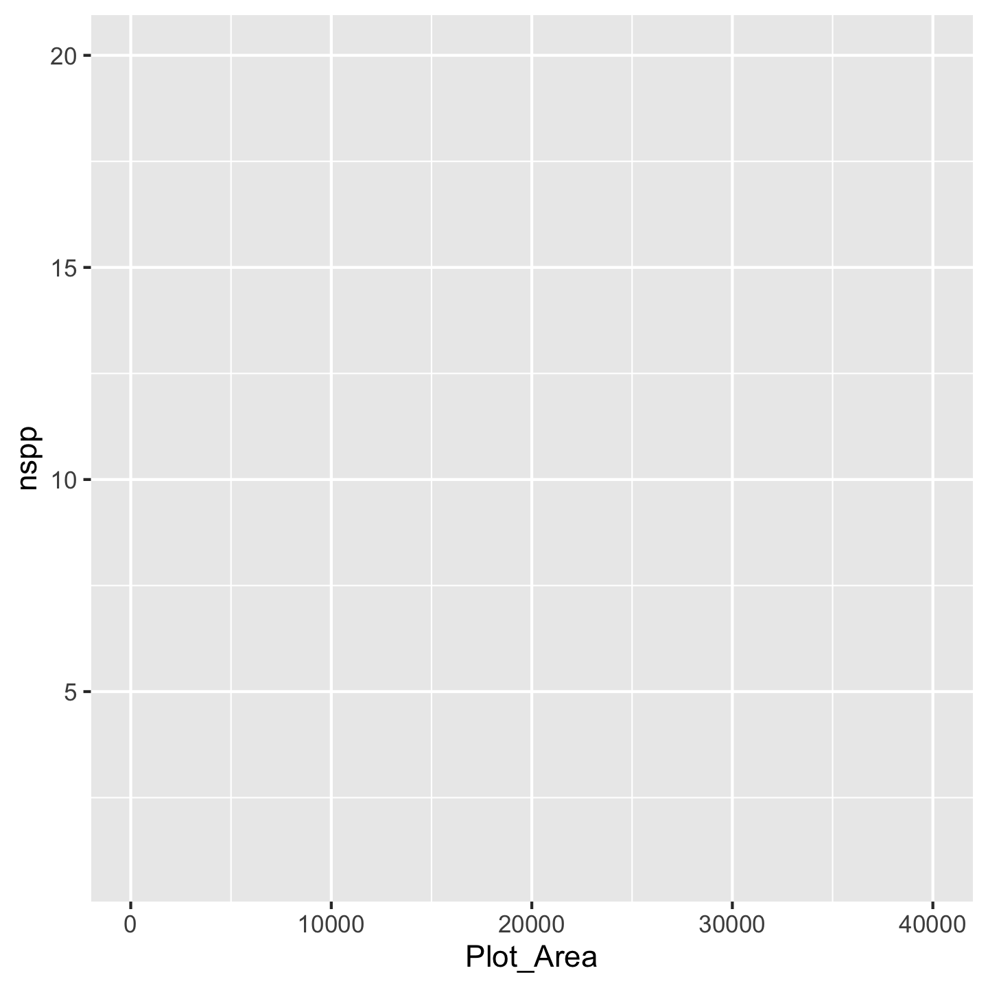
Now you can see we have our axes set up. The argument mapping is how we indicate which variables we actually want to work with (we “map” the variable to a part of the graph). We have to wrap those variable names in the aes function because the choice of variable is considered a visual aesthetic of the graphic. We still, however, don’t see any data other than the ranges on the axes. That’s because there are many different ways we could visualize Plot_Area and nspp. But for our question we need a scatter plot. In ggplot2 we get that by adding geom_point() to the mix
ggplot(data = dat_by_plot, mapping = aes(x = Plot_Area, y = nspp)) +
geom_point()
Wow we have a data visualization! Kind of a funny looking one, but something. All the different “kinds” of visualizations we can make are written in geom_* functions because those different kinds of visualizations are thought of as geometries by the authors of ggplot2.
Before we address that our visualization is kind of funny looking, let’s talk about being lazy with code. R lets us be lazy by not always forcing us to write the argument names. It matches up the inputs we give it with the arguments by order. So we can write this ggplot(dat_by_plot, aes(x = Plot_Area, y = nspp)) and ggplot knows that the first input dat_by_plot should correspond to the first argument data. And ggplot knows that the second input aes(x = Plot_Area, y = nspp) should correspond to the second argument mapping. That same approach applies to the x and y arguments in aes, we can leave them unnamed and aes will figure it out. That means we can write a lot less code—be lazy (this approach is literally called lazy evaluation)—and get the same product.
ggplot(dat_by_plot, aes(Plot_Area, nspp)) +
geom_point()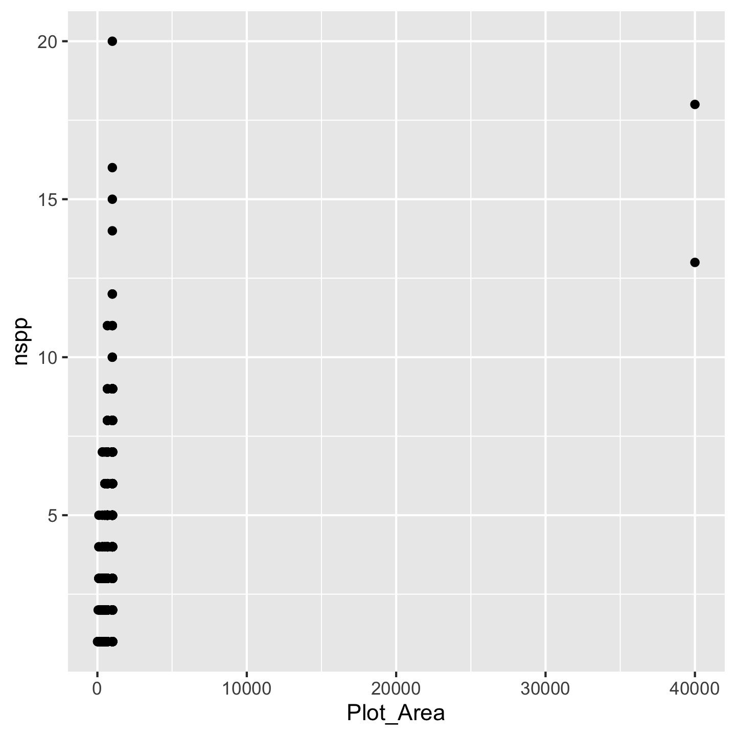
Now what to do about the funny looking visualization. Its really those outliers with really large Plot_Area. When we have a huge range across one axis with outliers, log-transforming it can help
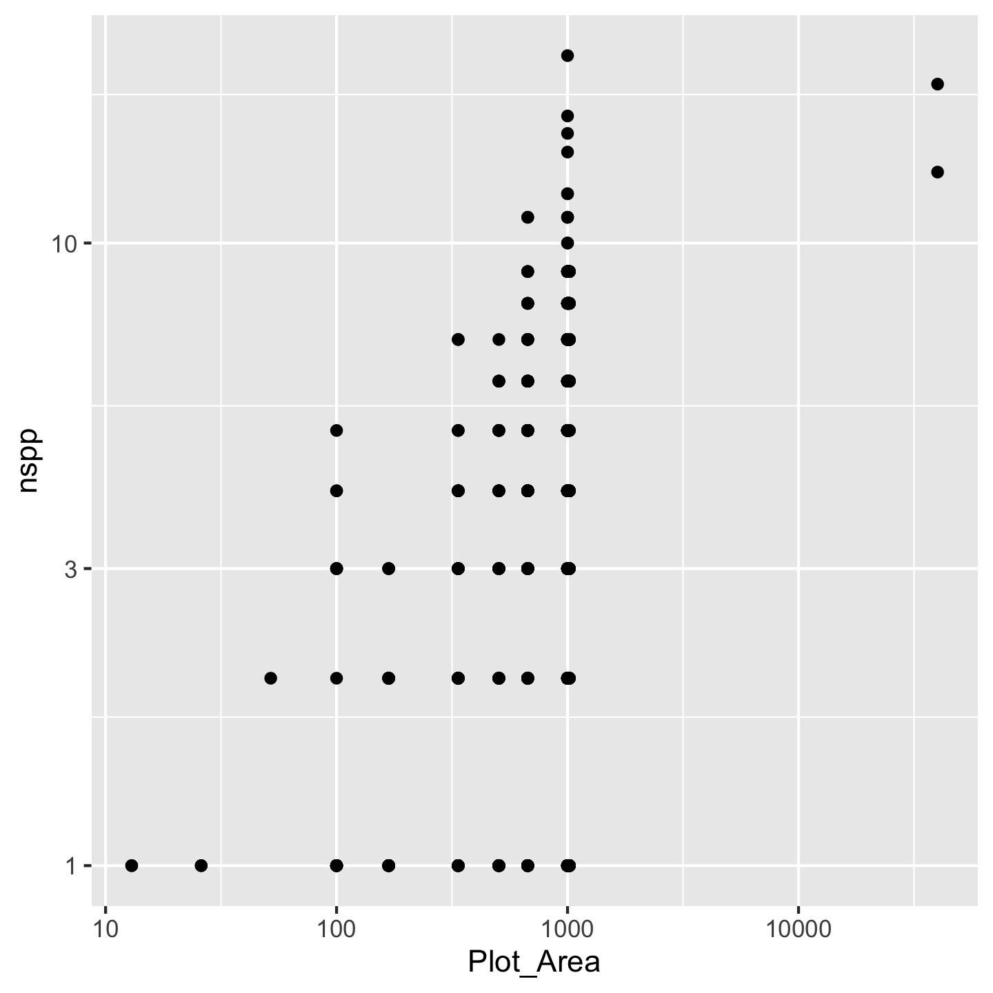
ggplot(dat_by_plot, aes(Plot_Area, nspp)) +
geom_point() +
scale_x_continuous(transform = "log10")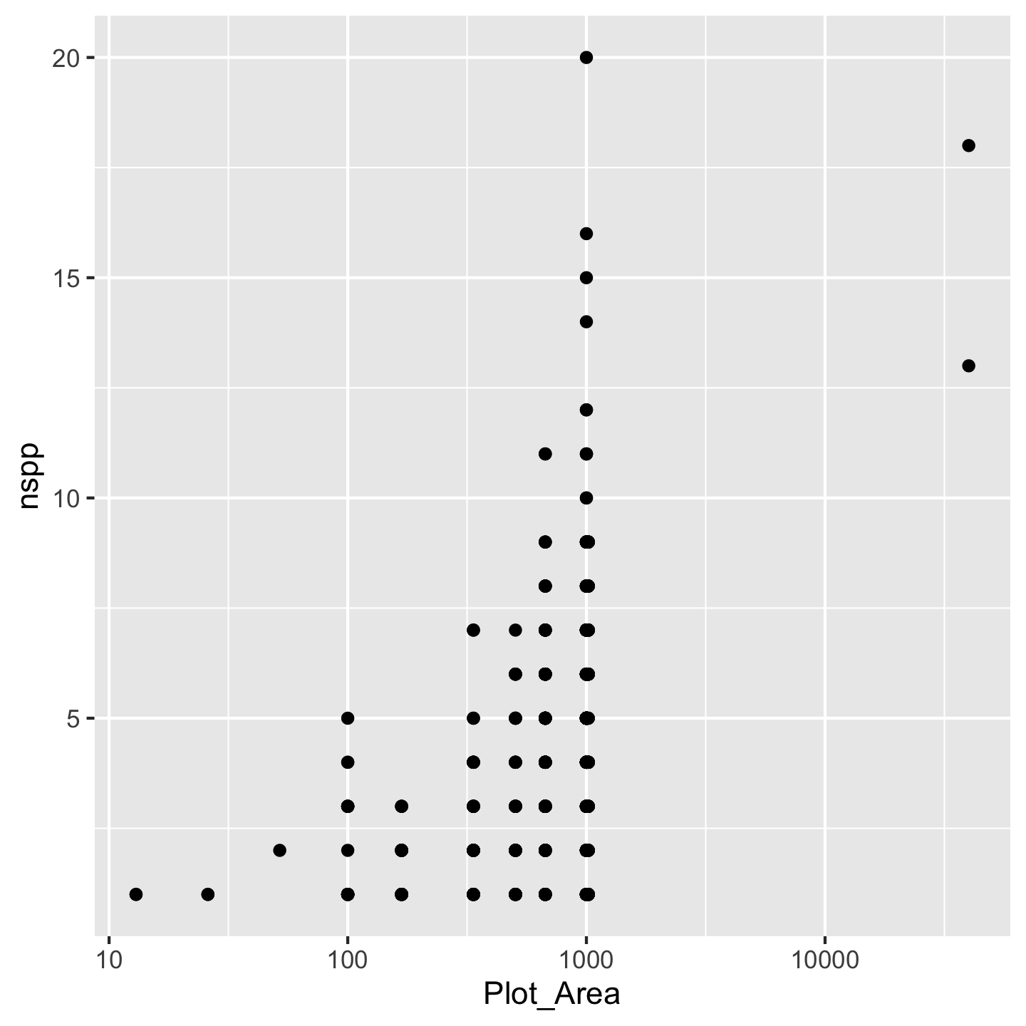
Nice, we see that species richness generally increases with plot area. That makes sense. We achieved the log-transformation with scale_x_continuous(transform = "log10"). Breaking that down: scale_x_continuous because we want to change the scale of the x-axis which is a continuous variable and transform = "log10" because we want a log-transformation. You might ask why we had to name the argument transform = "log10" instead of just typing scale_x_continuous("log10"). The reason is that transform is not the first argument to `scale_x_continuous. Turns out transform is the \(10^{th}\) argument and name is the first. We can skip over arguments 1 through 10 because ggplot2 has given them meaningful default values—values it will automatically use for those arguments if we say nothing at all. That is also why calling geom_point() without any arguments works: there are lots of arguments to geom_point, but they all have default values.
Think back to ecology classes or biogeography. If you remember anything about the “species area relationship” you’ll know that we tend to assume the affect of area \(A\) on species richness \(S\) is
\[ S = cA^z \]
If we log both sides of that equation we get a linear equation
\[ \log(S) = \log(c) + z\log(A) \]
That suggests we should log-transform both the x- and y-axes.
NoteYour turn
Modify the ggplot code to log both the x- and y-axes. Do you have a guess of how to do it? Once you succeed your graphic will look like this
CautionSolution
While you’re at it, compare the log-transformed plot and the not-log-transformed plot. What changes about the axes and why?
What if other variables impact how species richness tends to increase with area? How could we add another variable to the plot without it looking like a ridiculous 3D thing? The most common approach is to color code the points (or perhaps modify another aesthetic like shape or size). Let’s color points according to which island the inventory plots are on.
ggplot(dat_by_plot, aes(Plot_Area, nspp, color = Island)) +
geom_point() +
scale_x_continuous(transform = "log10") +
scale_y_continuous(transform = "log10")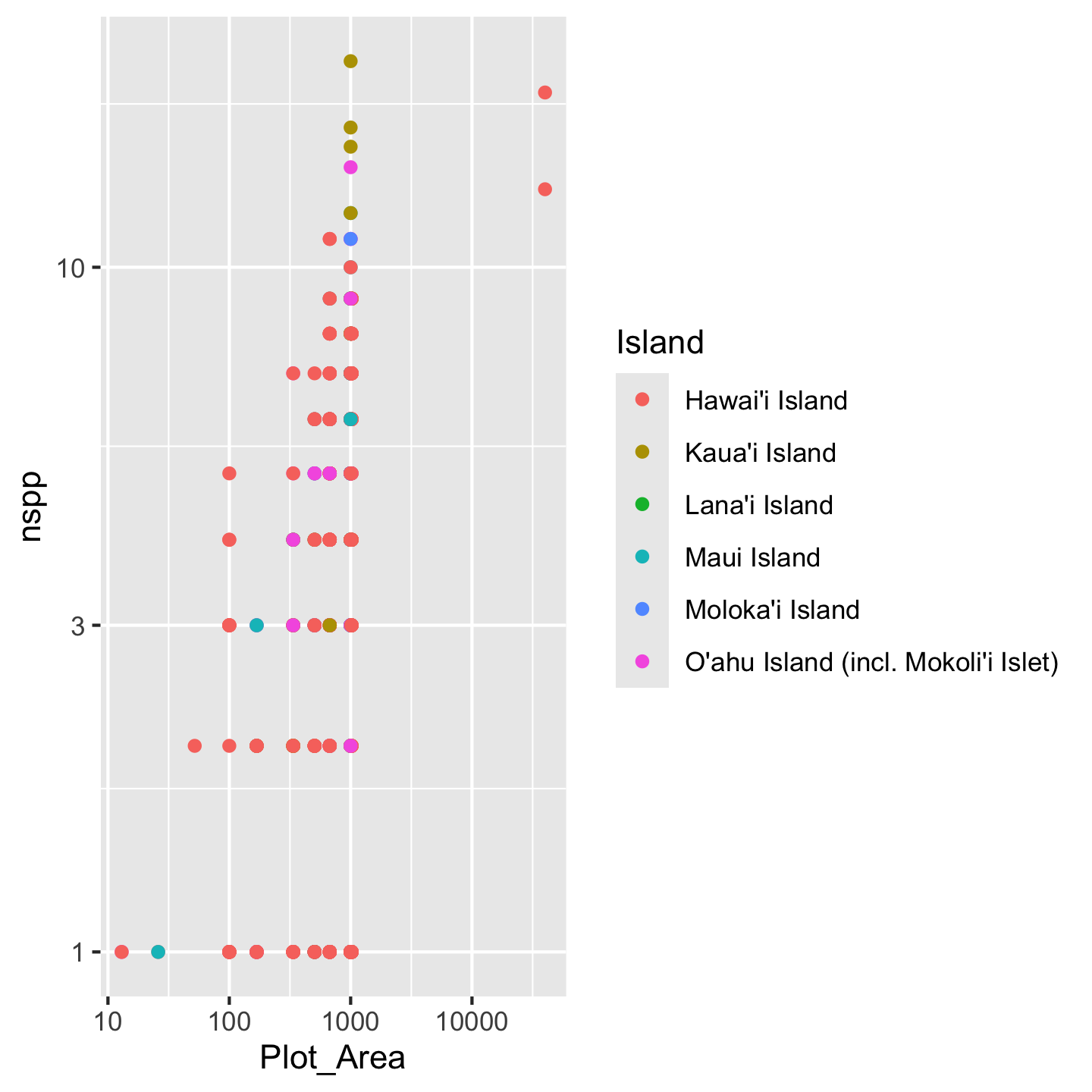
Crazy! There seem to be some interesting patterns, but it’s kind of hard to see. We need to make some changes:
- shorten the island names so the legend doesn’t take up half the graphic
- order the islands in a meaningful order (how about oldest to youngest)
- pick better colors
3.10.1 Refining labels in ggplots
One option for refining the island names (considered a “label” in ggplot2) is to simply re-name them in the plot itself. We can use the layering function scale_color_discrete to specify what we want the labels to be:
ggplot(dat_by_plot, aes(Plot_Area, nspp, color = Island)) +
geom_point() +
scale_x_continuous(transform = "log10") +
scale_y_continuous(transform = "log10") +
scale_color_discrete(labels = c("Hawaiʻi", "Kauaʻi", "Lānaʻi",
"Maui", "Molokaʻi", "Oʻahu"))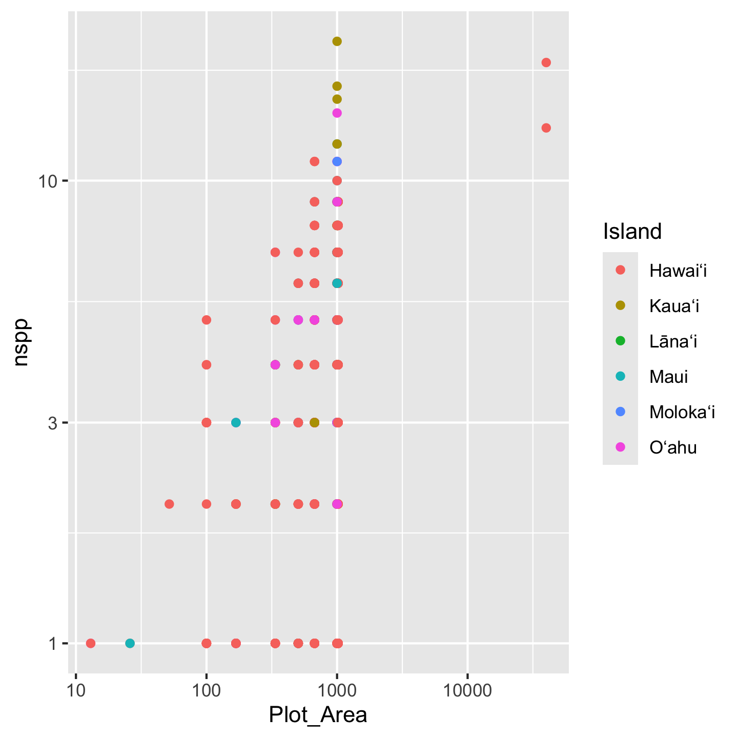
Note that we have to be very careful to list the labels in the same order they appear in the legend. If we mess that up, our graphic will be just plain wrong. For that reason, this approach of changing the labels in the graph, is considered fragile and not best practice. Best practice is to refine the actual values of the variable (Island) in the data object itself. We can use mutate to modify the Island column and within mutate use case_match to create the more refined variable values we want:
dat_by_plot <- mutate(dat_by_plot,
Island = case_match(
Island,
"O'ahu Island (incl. Mokoli'i Islet)" ~ "Oʻahu",
"Hawai'i Island" ~ "Hawaiʻi",
"Maui Island" ~ "Maui",
"Moloka'i Island" ~ "Molokaʻi",
"Lana'i Island" ~ "Lānaʻi",
"Kaua'i Island" ~ "Kauaʻi"
))You’ll notice case_match uses a kind of funny syntax: "old label" ~ "new label". This syntax indicates a mapping of the original value to a new value.
This might also look kind of fragile: what if we misspell the old value we’re trying to replace? Luckily, R will let you know (not the case with scale_color_discrete(labels = c(....), which makes this approach less fragile:
mutate(dat_by_plot,
Island = case_match(
Island,
# deliberate misspelling
"Oahu (incl. Mokoli'i Islet)" ~ "Oʻahu",
"Hawai'i Island" ~ "Hawaiʻi",
"Maui Island" ~ "Maui",
"Moloka'i Island" ~ "Molokaʻi",
"Lana'i Island" ~ "Lānaʻi",
"Kaua'i Island" ~ "Kauaʻi"
))# A tibble: 530 × 26
Plot_ID Island Study Plot_Area Year Census lon lat evapotrans_annual_mm
<int> <chr> <chr> <dbl> <int> <int> <dbl> <dbl> <dbl>
1 1 <NA> Knigh… 1000 2012 1 -158. 21.4 818.
2 2 <NA> Zimme… 1018. 2003 1 -155. 19.4 934.
3 3 <NA> Zimme… 1018. 2003 1 -155. 19.4 934.
4 4 <NA> Zimme… 1018. 2003 1 -155. 19.4 934.
5 5 <NA> Zimme… 1018. 2003 1 -155. 19.4 934.
6 6 <NA> Zimme… 1018. 2003 1 -155. 19.4 934.
7 7 <NA> Zimme… 1018. 2003 1 -155. 19.4 934.
8 8 <NA> Zimme… 1018. 2003 1 -155. 19.4 934.
9 9 <NA> Zimme… 1018. 2003 1 -155. 19.4 934.
10 10 <NA> Zimme… 1018. 2003 1 -155. 19.4 934.
# ℹ 520 more rows
# ℹ 17 more variables: avbl_energy_annual_wm2 <dbl>, cloud_freq_annual <dbl>,
# ndvi_annual <dbl>, rain_annual_mm <dbl>, avg_temp_annual_c <dbl>,
# hii <dbl>, age_yr <dbl>, elev_m <dbl>, nspp <int>, nspp_native <int>,
# prop_spp_native <dbl>, basal <dbl>, basal_native <dbl>,
# prop_basal_native <dbl>, total_abund <int>, total_abund_native <int>,
# prop_abund_native <dbl>We get an NA for what we misspelled. We would then easily see the NA in the graphic and know something went wrong so we could go back and fix it.
With the values themselves now aligning with what we want, we can make our graphic without need to specify labels in scale_color_discrete(labels = c(....
ggplot(dat_by_plot, aes(Plot_Area, nspp, color = Island)) +
geom_point() +
scale_x_continuous(transform = "log10") +
scale_y_continuous(transform = "log10")
We still have the issue of islands showing up in a nonsense order. For this we have to go back to factors, which, recall, are like character objects that have a sense of ranking or ordering. We will again use mutate to modify the Island column.
dat_by_plot <- mutate(dat_by_plot,
Island = factor(
Island,
levels = c("Kauaʻi", "Oʻahu", "Molokaʻi",
"Lānaʻi", "Maui", "Hawaiʻi")
))Again, if we misspell any of the levels we will get NA values in the Island column and be able to realize and fix our mistake. And now the islands display in a sensible order
ggplot(dat_by_plot, aes(Plot_Area, nspp, color = Island)) +
geom_point() +
scale_x_continuous(transform = "log10") +
scale_y_continuous(transform = "log10")
While we are on the topic of labels, we might as well improve the x- and y-axis labels. The default labels, you may notice, are just the column names. We could modify the data object again to have column names equal to the axis names we want. This is actually not the conventional approach; instead we usually modify the axis labels in the ggplot itself for two reasons:
- often we want axis labels in normal human language with spaces and/or punctuation; spaces and some punctuation (but not all) can be allowed in column names, but it is not recommended
- the chances for introducing data representation errors are much lower in re-labeling axes compared to re-labeling data values
To change axis labels we use xlab and ylab.
ggplot(dat_by_plot, aes(Plot_Area, nspp, color = Island)) +
geom_point() +
scale_x_continuous(transform = "log10") +
scale_y_continuous(transform = "log10") +
xlab("Plot area (ha)") +
ylab("Number of species")
3.10.2 Storing a ggplot as an object
One pretty cool think about ggplot is that you can store a graphic as an object. Then if you want to continue adding layers to the visualization you can add them to the object like this:
# store the basic graph set-up in an object
sar <- ggplot(dat_by_plot, aes(Plot_Area, nspp, color = Island)) +
geom_point() +
scale_x_continuous(transform = "log10") +
scale_y_continuous(transform = "log10")
sar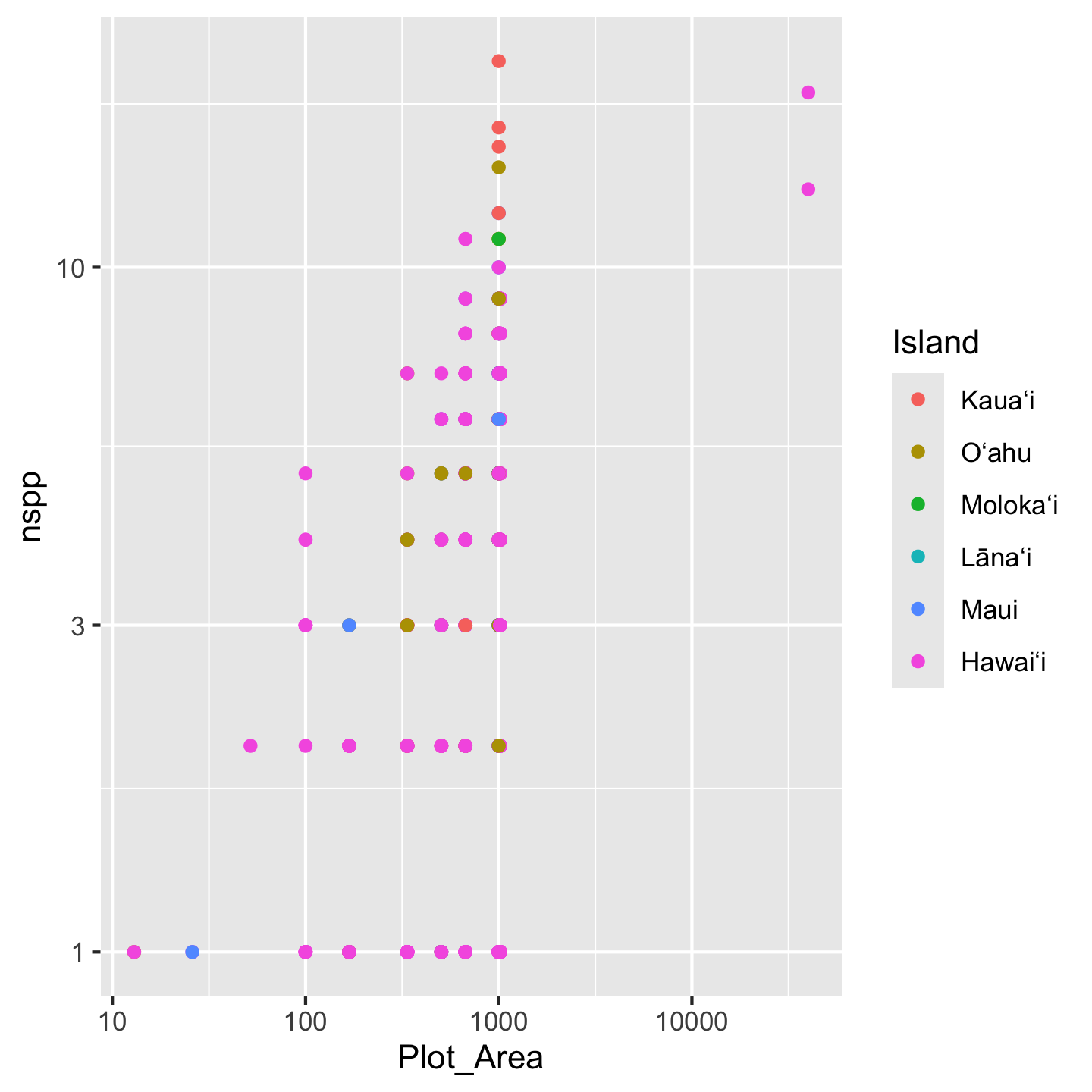
# now further refinement can be added to the *object*
sar +
xlab("Plot area (ha)") +
ylab("Number of species")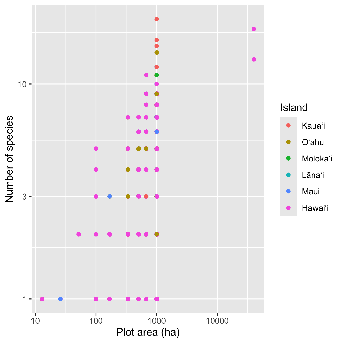
3.10.3 Customizing color
The last customization of the graphic we set out to make was picking better colors. ggplot2 has a lot of options to customize colors. All these options exist as functions with names starting with scale_color_*, including scale_color_manual which lets you have complete control over color coding data. Often complete control is over rated and we can let ggplot2 automate some choices for us. A crowd favorite are the viridis color palettes. We will use scale_color_viridis_d with the d indicating that the data we are coloring have discrete (i.e. not continuous number) values.
# remeber, we stored the core graphic in the `sar` object
sar +
xlab("Plot area (ha)") +
ylab("Number of species") +
scale_color_viridis_d(option = "magma")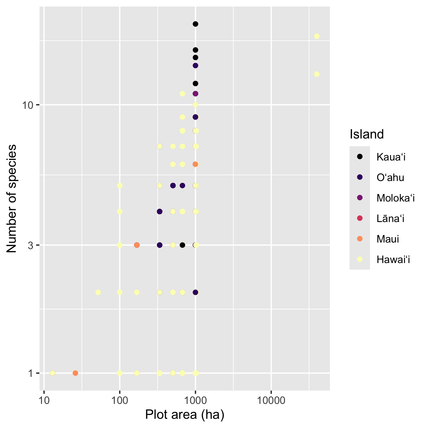
The argument option = "magma" chooses from several different pallets offered by viridis and seemed fitting for these data.
3.10.4 Faceting
The patterns in the data are, frankly, still hard to see because multiple points fall on top of each other. There could be a few different approaches taken (some of which we’ll look at in other contexts) like making points semi-transparent (although that works best when we are not color coding points) or jittering points (although that is not ideal for a scatter plot with numeric variables for both axes). Instead, our best option is to add facets, which split the data across multiple panels so we can see one group (Island in this case) per panel. Faceting is one super power of ggplot2.
sar +
xlab("Plot area (ha)") +
ylab("Number of species") +
scale_color_viridis_d(option = "magma") +
facet_wrap(vars(Island))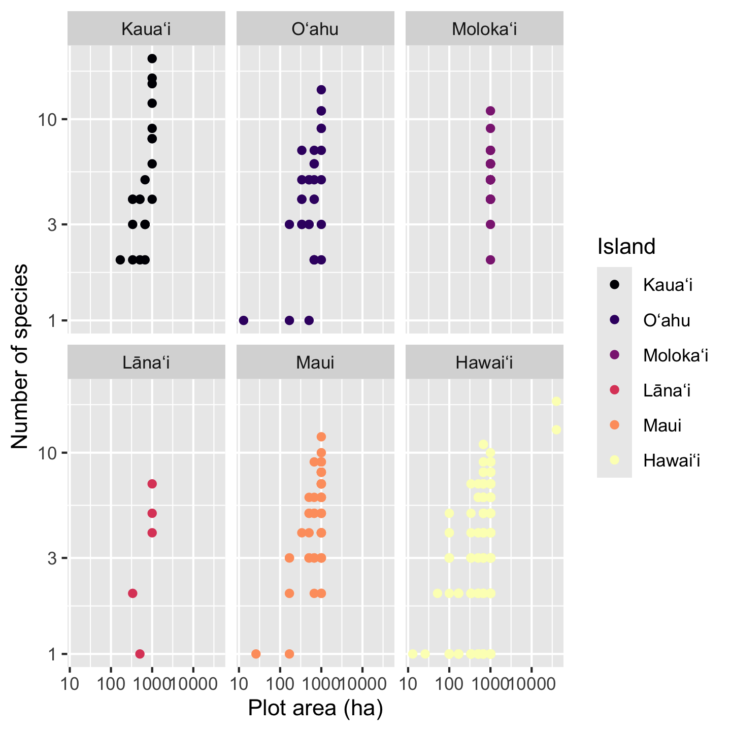
The function facet_wrap needs to be told what variable to facet by, in this case Island. For reasons obscured deep in the design choices of ggplot2 we have to put that variable inside the vars function for it to be used in faceting.
With a faceted graphic the colors are now not strictly necessary, but neither are they unnecessary. What is, however, unnecessary is the legend so let’s remove it
sar +
xlab("Plot area (ha)") +
ylab("Number of species") +
scale_color_viridis_d(option = "magma") +
facet_wrap(vars(Island)) +
theme(legend.position = "none")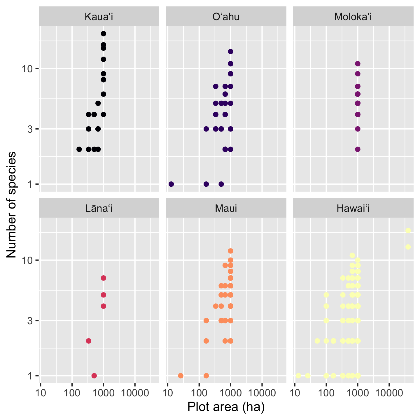
The last change we might like is making the points slightly transparent. That wasn’t a great idea when all the islands had points on top of each other, but now with the facets, the transparent points can help us see if some areas of the graphic have a high density of data points compared to others. The argument alpha sets transparency and can be passed to either geom_point or scale_color_viridis_d. We’ll pass it to scale_color_viridis_d
sar +
xlab("Plot area (ha)") +
ylab("Number of species") +
scale_color_viridis_d(option = "magma", alpha = 0.5) +
facet_wrap(vars(Island)) +
theme(legend.position = "none")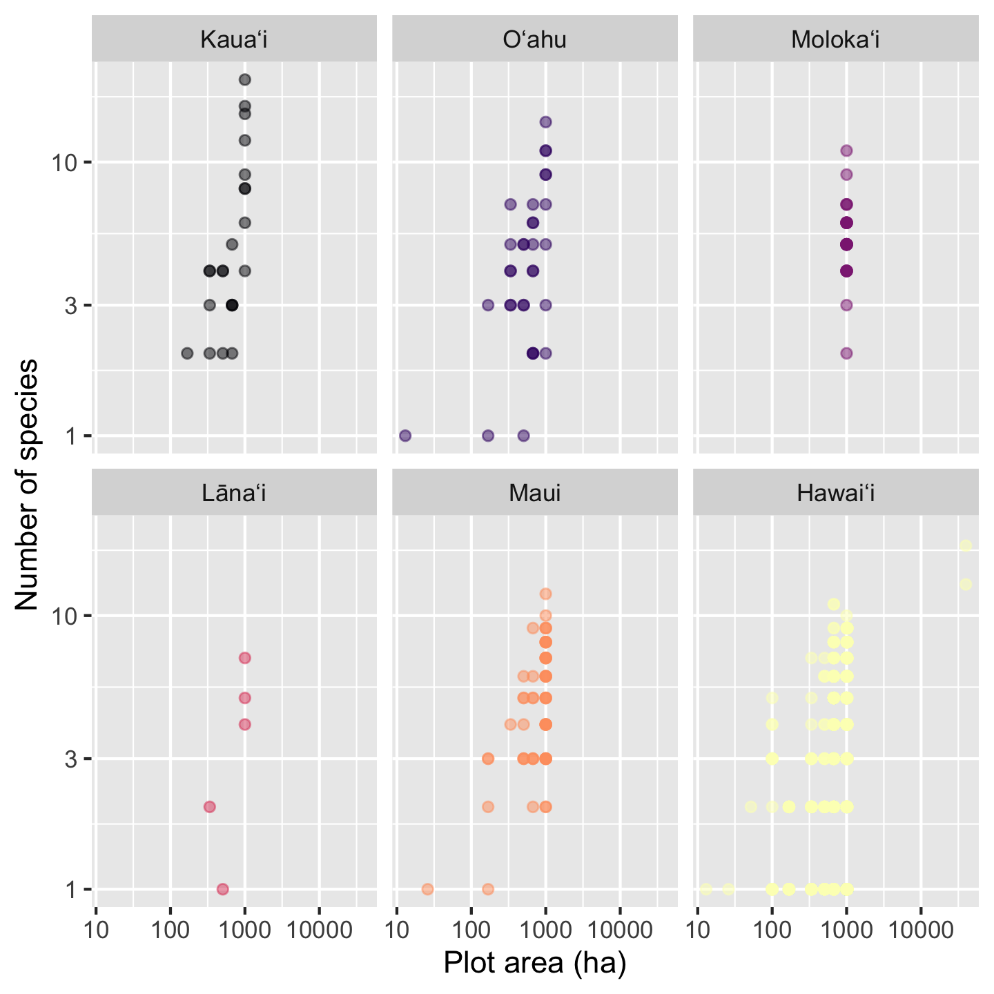
3.10.5 Coloring data based on a numerical variable
Up to now we used color to represent a categorical variable—island. We can also use color to represent a numerical variable. For example, what if the effect of area on species richness is modulated by the proportion of native versus non-native
# we'll make a ggplot object for ease of
# modifying later
sar_nat <- ggplot(dat_by_plot,
aes(Plot_Area, nspp,
color = prop_abund_native)) +
geom_point() +
scale_x_continuous(transform = "log10") +
scale_y_continuous(transform = "log10") +
xlab("Plot area (ha)") +
ylab("Number of species") +
facet_wrap(vars(Island))
# view our first draft graphic
sar_nat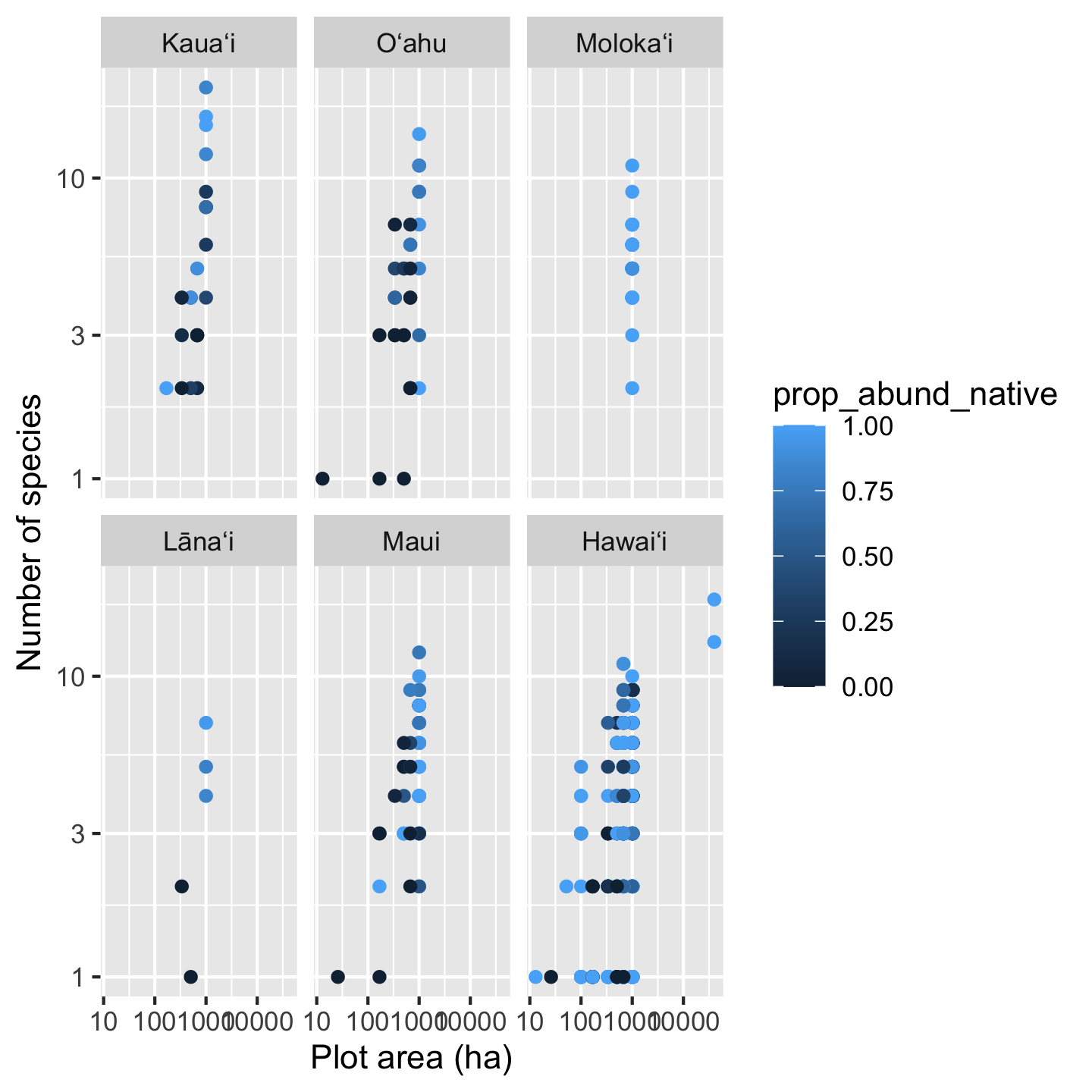
Something interesting is going on here for sure, but the color pallet makes it a little hard to tell. Again the viridis color pallets will help us more clearly see the patterns. We now use scale_color_viridis_c, with c for continuous since the data we use for coloring are numeric.
sar_nat +
scale_color_viridis_c()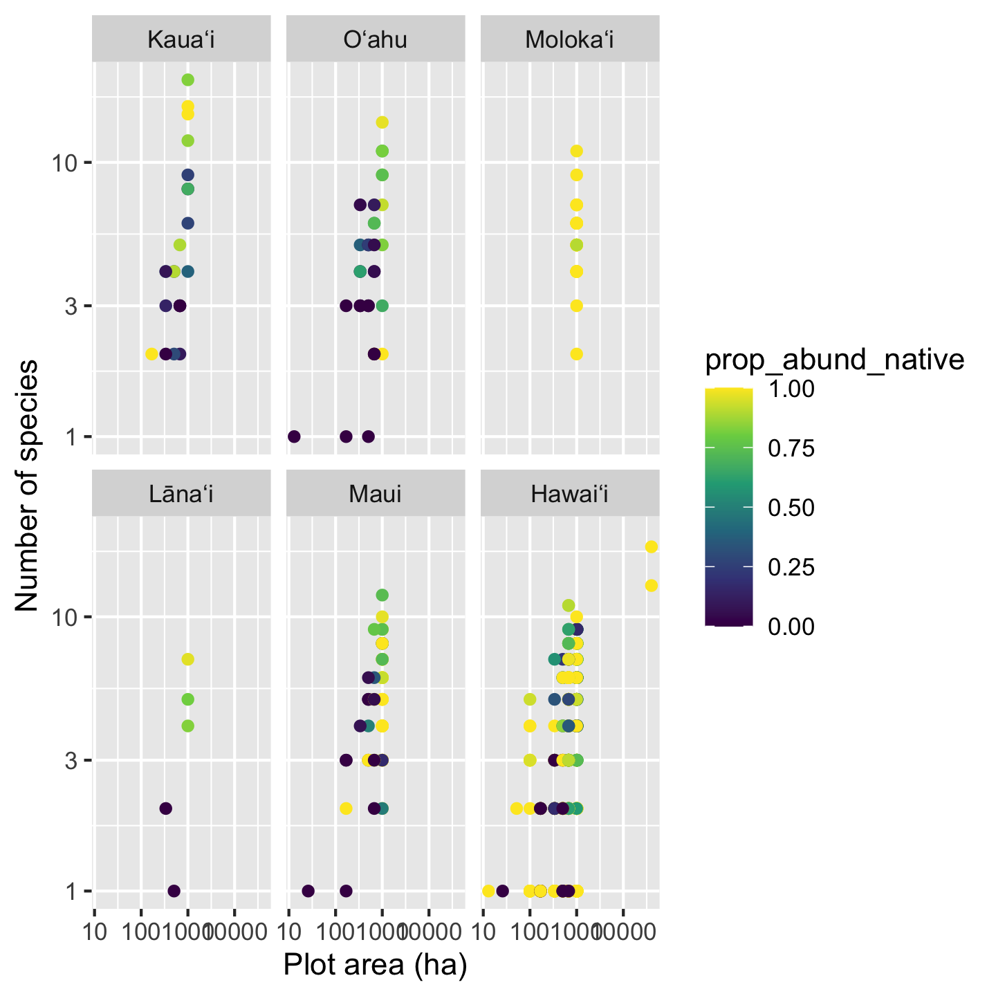
Now we can really see that most of the time high richness plots are dominated by native trees, low richness plots are dominated by non-native trees. But also we can see there are plenty of deviations to this pattern, especially with some very diverse plots being mixed and some mono-dominate (single species) plots on Hawaiʻi being all native.
One last cosmetic fix we might want to make is changing the name of the legend. We do this simply with the name argument passed to scale_color_viridis_c
sar_nat +
scale_color_viridis_c(name = "Proportion\nnative trees")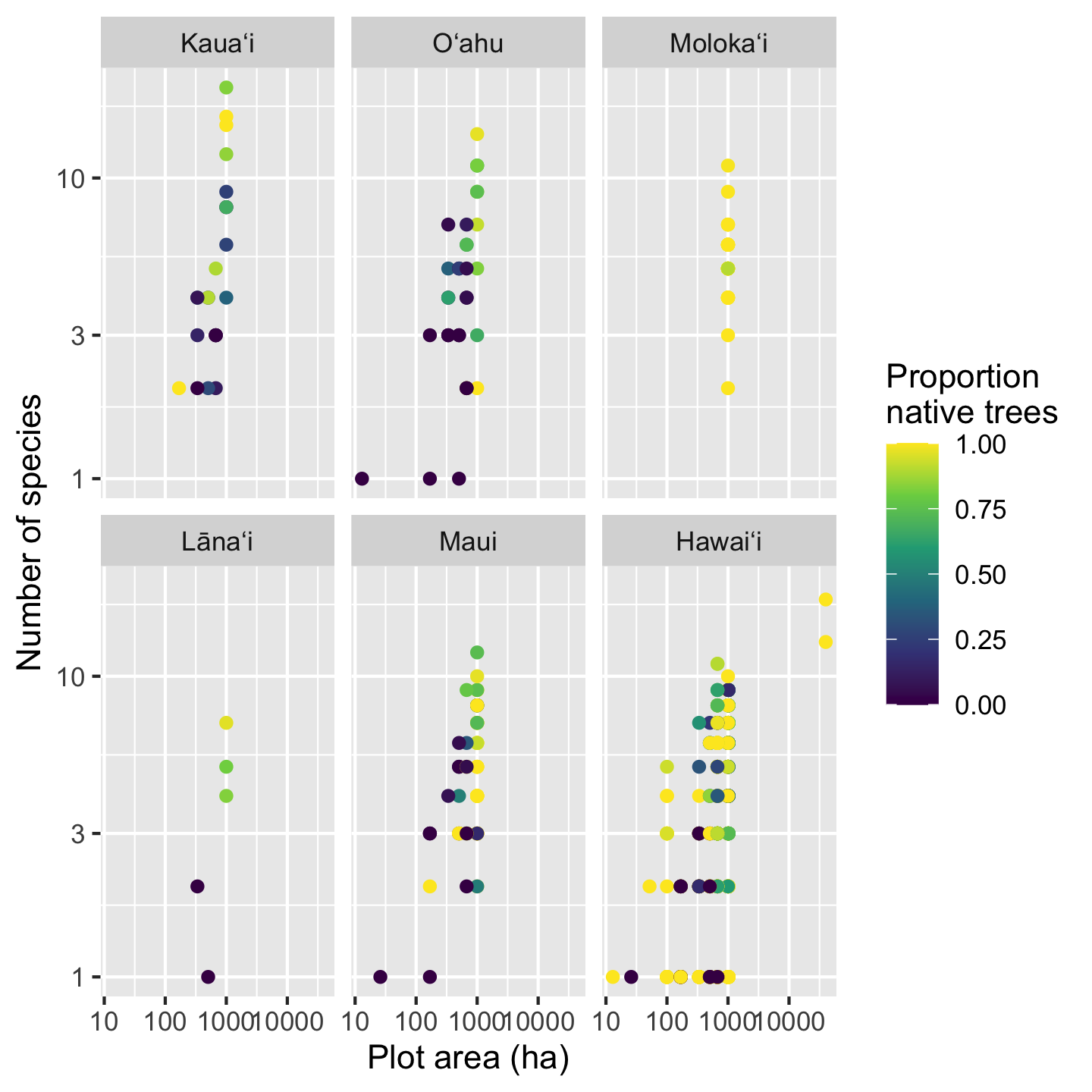
Notice a little trick there to make the name wrap across two lines: the \n between “Proportion” and “native” introduces a newline. It is easy to introduce a newline when directly typing the text, but when text is pulled from the data (e.g. axis labels) there are better automated approaches, for example the label_wrap function in the scales package.
3.10.6 Graphics to show central tendency and spread across groups
So far we have looked extensively at scatter plots. But there are a lot of other graphics out there. One very common group of graphics are those that show how the central tendency of data (and the spread about the center) change across different groups. One intuitive grouping we have is island, so let’s look at how some variables differ across islands. It is also a good idea to get a sense of how our data look before we embark on statistical analyses: understanding how the data look could inform what considerations we want to make in our analyses.
3.10.6.1 The boxplot
The box plot is a classic visualization of how the central tendency and spread of data change across groups. Let’s look at the density of individuals per plot across islands.
ggplot(dat_by_plot, aes(Island, total_abund / Plot_Area)) +
geom_boxplot() +
ylab(expression("Tree density ("*ha^-1*")"))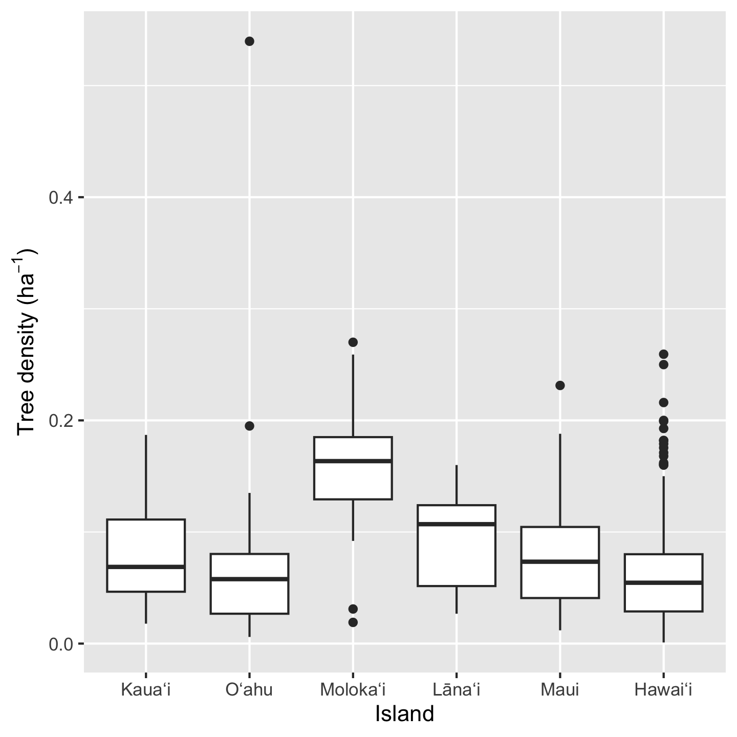
Three things to notice here: we can do math inside ggplot commands (e.g. we calculated density as total_abund / Plot_Area), the geom_* for a box plot is geom_boxplot, and we made a fancy y-axis label. In order the make “per hectare” (ha\(^{-1}\)) we used the expression function. This function prints out text as is (e.g. "Tree density (") but then formats math syntax as math text (e.g. *ha^-1* gets formatted as \(ha^{-1}\) and the * indicate no spaces).
3.10.6.2 The histogram
Histograms are a great way to get a sense of how the data are distributed, including their central tendency and spread. Because ggplot2 makes it so easy to facet graphics, we can easily view multiple histograms stack on top of each other
ggplot(dat_by_plot, aes(total_abund / Plot_Area)) +
geom_histogram() +
facet_grid(vars(Island)) +
xlab(expression("Tree density ("*ha^-1*")")) +
ylab("Number of plots")`stat_bin()` using `bins = 30`. Pick better value `binwidth`.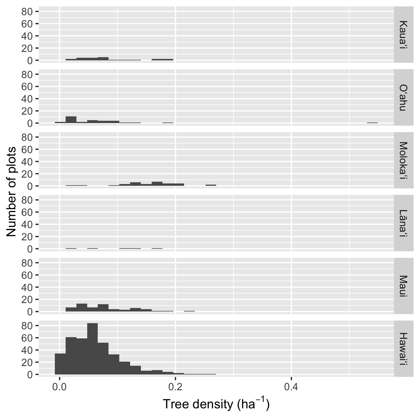
Because Hawaiʻi contains so many plots, the histogram heights are hard to read for the other plots. In such a situation we can consider if we want to over-ride the default graphic behavior and make the y-axis limits independent for each facet:
ggplot(dat_by_plot, aes(total_abund / Plot_Area)) +
geom_histogram() +
facet_grid(vars(Island), scale = "free_y") +
xlab(expression("Tree density ("*ha^-1*")")) +
ylab("Number of plots")`stat_bin()` using `bins = 30`. Pick better value `binwidth`.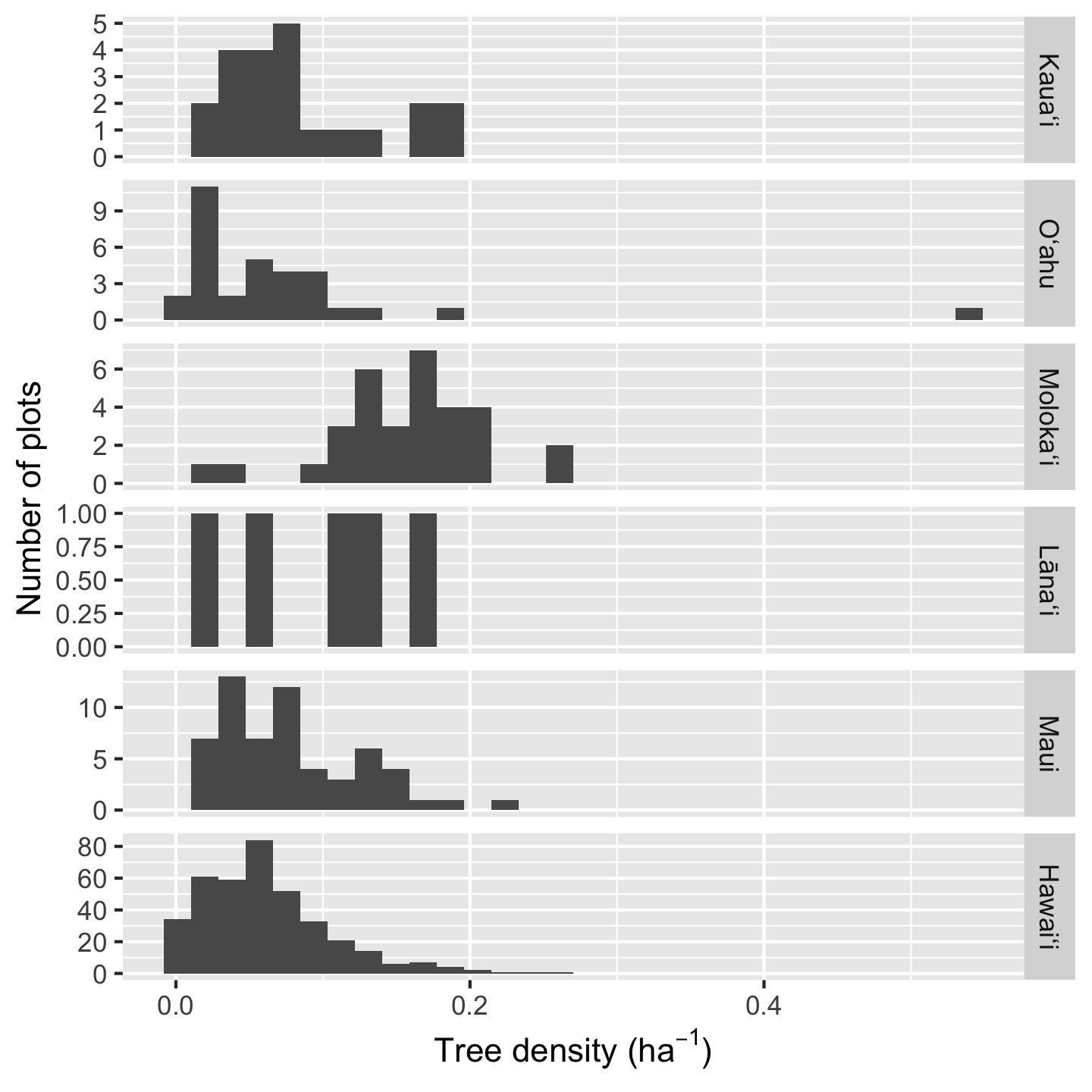
Another solution is to use the increasingly popular “ridgeline plot” which shows (by default) a smoothed density representation of a histogram, and stacks the density curves in visually pleasing way. These graphics require an additional package: ggridges.
library(ggridges)
ggplot(dat_by_plot,
aes(total_abund / Plot_Area, y = Island, fill = (Island))) +
geom_density_ridges() +
scale_fill_viridis_d(option = "magma") +
theme(legend.position = "none")Picking joint bandwidth of 0.0208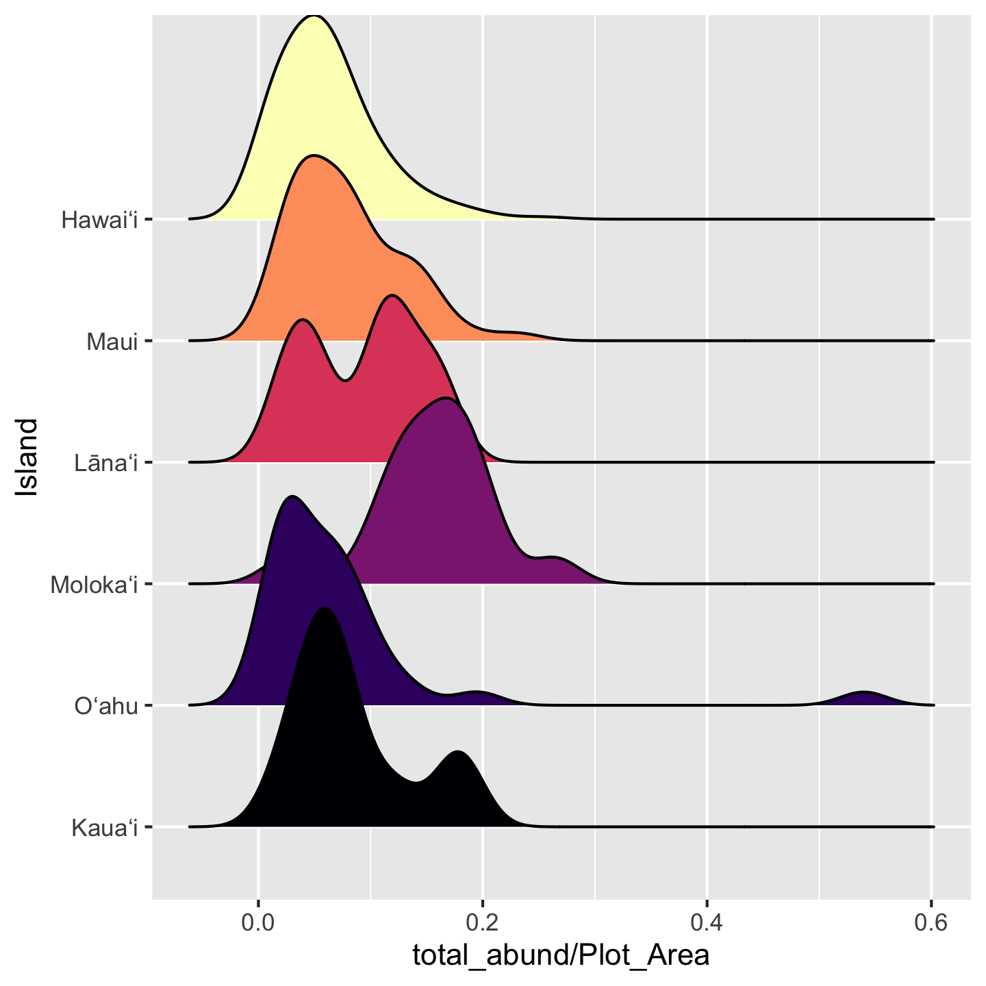
3.10.7 Graphics to show proportions and frequencies
You may have seen many a bar graph (hopefully with error bars) used to show mean and uncertainty, but communicating that type of information is better suited to the visualizations we just covered. The bar graph is great for proportions and frequencies.
When introducing the data we were curious about the number of plots where greater than three quarters of their trees belong to native species. We found that across the entire pae ʻāina this proportion is about 70%. But what about for each island? If we want to make a visual for that question, a bar graph would be a great choice.
ggplot(dat_by_plot, aes(Island, fill = prop_abund_native >= 0.75)) +
geom_bar()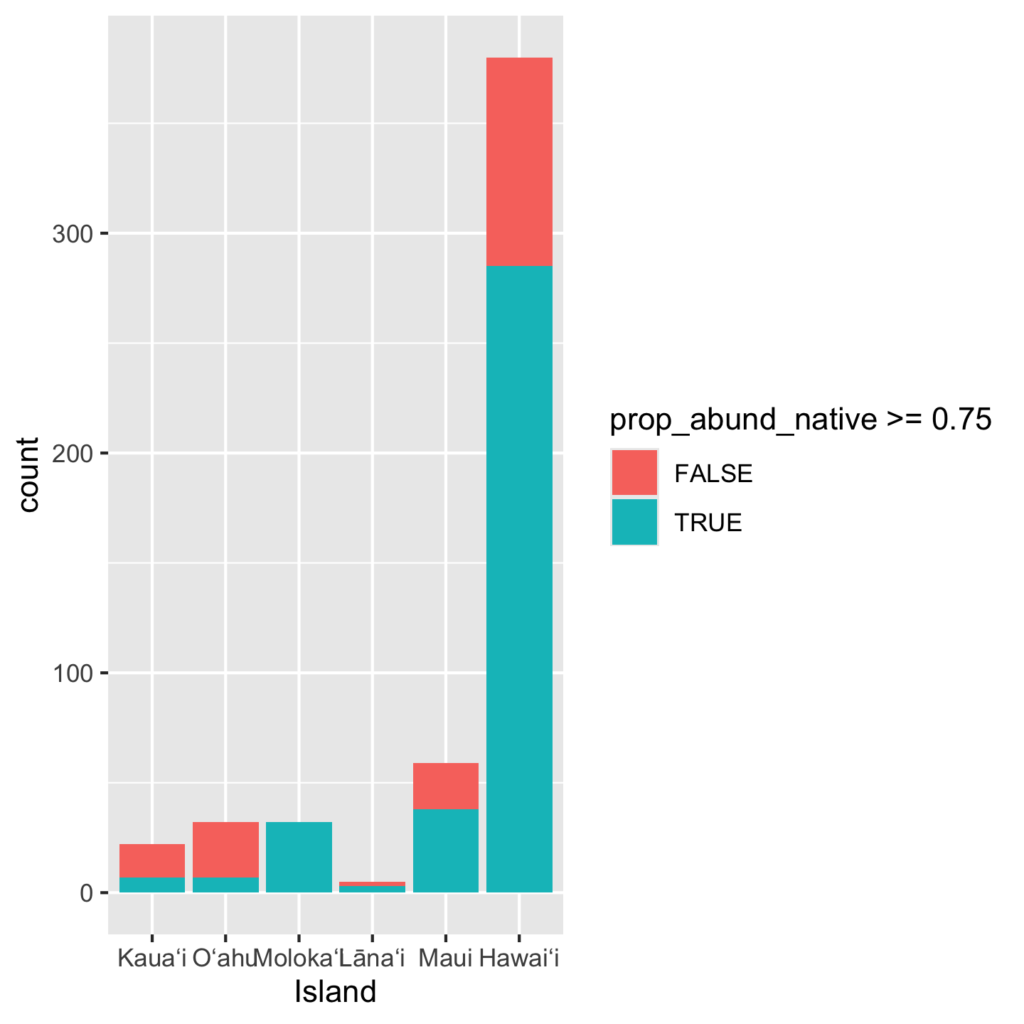
Notice we again did some math inside aes: we created a boolean of whether or not prop_abund_native is greater than or equal to 0.75. But the y-axis is showing as a count rather than a proportion. To get a proportion we use position = "fill"
ggplot(dat_by_plot, aes(Island, fill = prop_abund_native >= 0.75)) +
geom_bar(position = "fill") 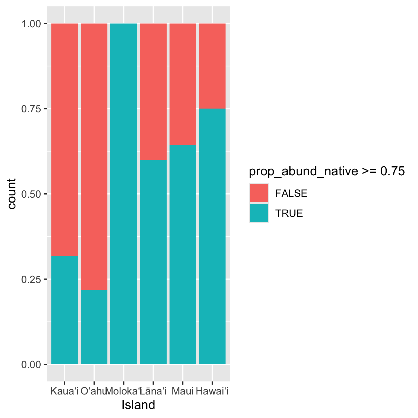
3.10.8 Themes
While we’re on the topic of customizing appearances, let’s talk about themes. The background grid seems very unnecessary in this last bar graph. How could we remove it? The quickest way is choosing a different theme for the visualization. There are many named themes like theme_classic that bundle multiple different cosmetic aspects of the graphic
ggplot(dat_by_plot, aes(Island, fill = prop_abund_native >= 0.75)) +
geom_bar(position = "fill") +
theme_classic()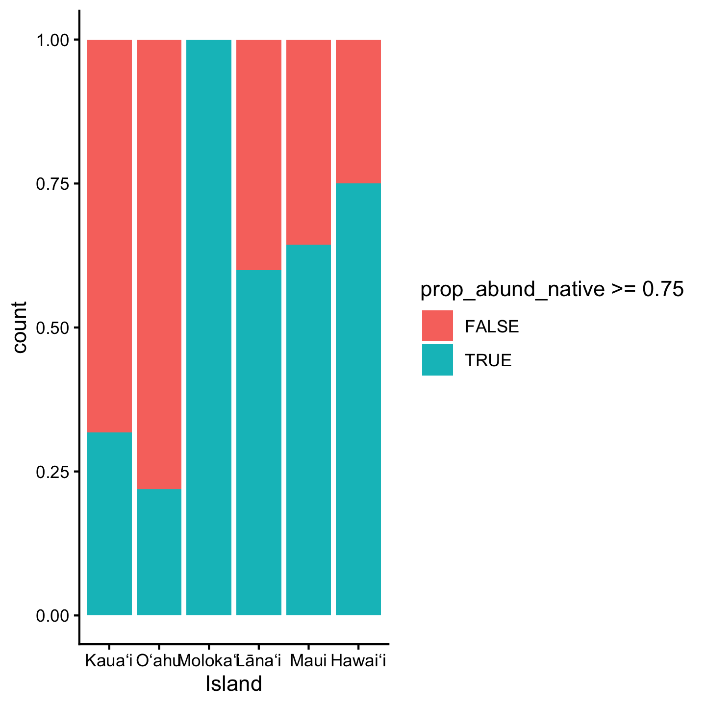
You can check out ?theme_classic and it will take you to a help page with many different named themes.
Different packages also offer custom themes. One popular one is theme_cowplot from the cowplot package.
library(cowplot)
Attaching package: 'cowplot'The following object is masked from 'package:gt':
as_gtableggplot(dat_by_plot, aes(Island, fill = prop_abund_native >= 0.75)) +
geom_bar(position = "fill") +
theme_cowplot()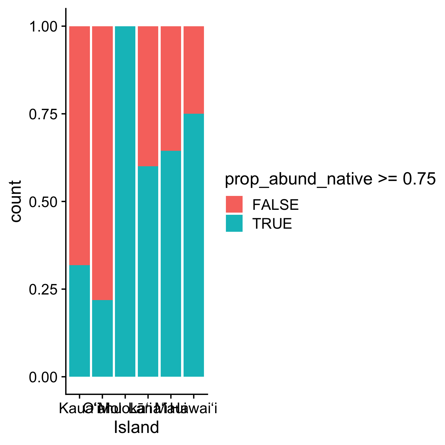
3.11 Resources
The Carpentries has a great R tutorial for ecologists. A few differences about their approach and ours: they use the magrittr pipe and instead of loading only the packages they need (like dplyr and readr) they load a massive collection of packages: tidyverse. That might seem convenient, but my (me, Andy, here) experience is that understanding which functions come from which specific packages is useful for writing reusable code.
Another great resource is a course website by Jenny Bryan who is one of those pros along side Hadley Wickham. The course website also uses %>% (though Jenny Bryan has more recently switched to |>) and tidyverse, so pay mind to those differences.
3.12 References
Wickham H. 2014. Tidy data. Journal of statistical software 59:1–23.
Wickham H, François R, Henry L, Müller K, Vaughan D. 2023. Dplyr: A grammar of data manipulation. Available from https://CRAN.R-project.org/package=dplyr.
3.2.1 Comments
Use
#for comments and make sure there is a space after the#. Comments should lookand not